Works That Work
Branding2012
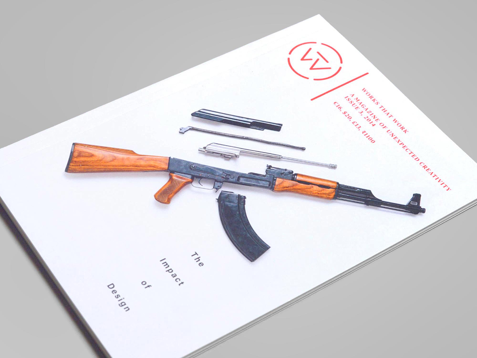
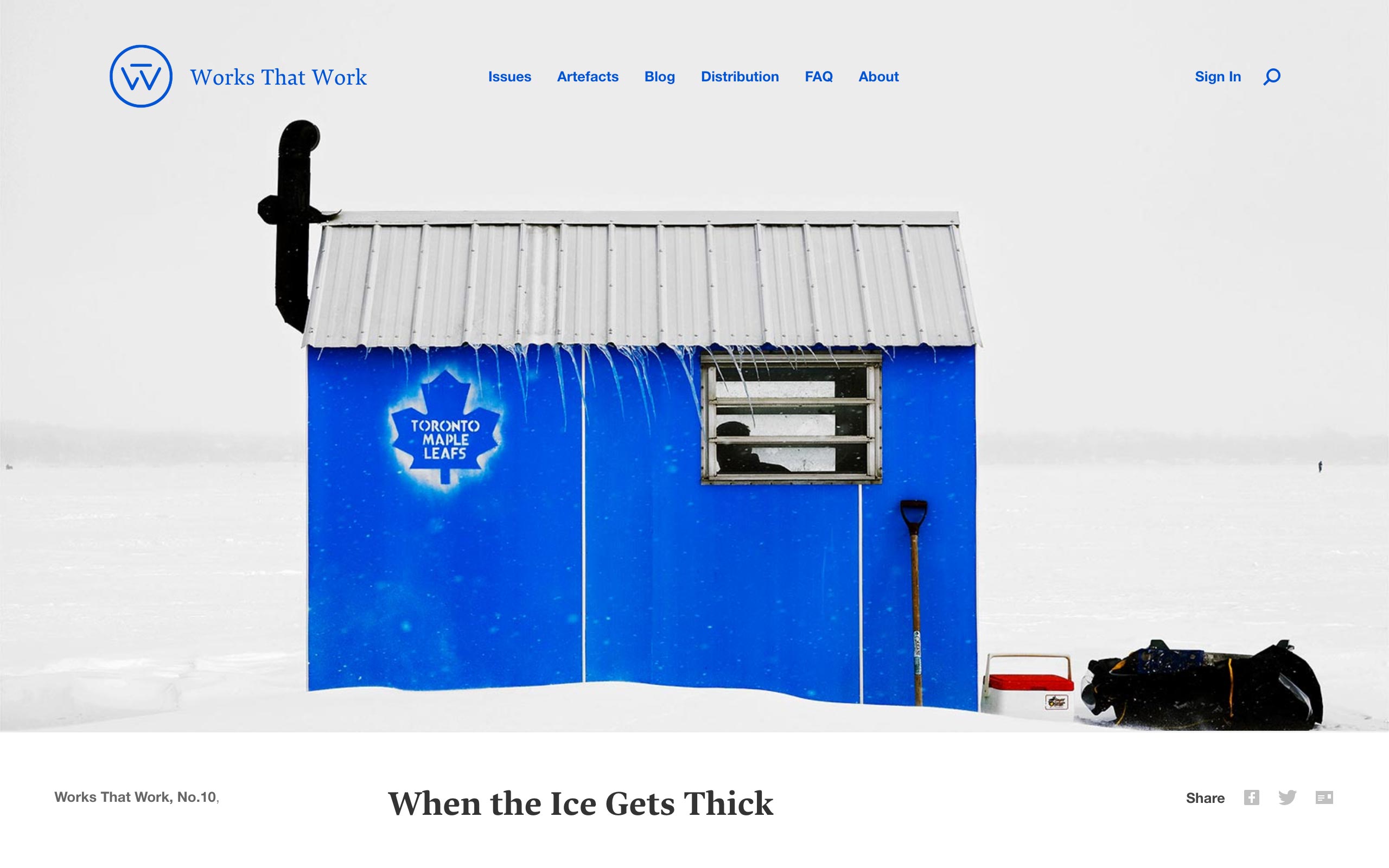
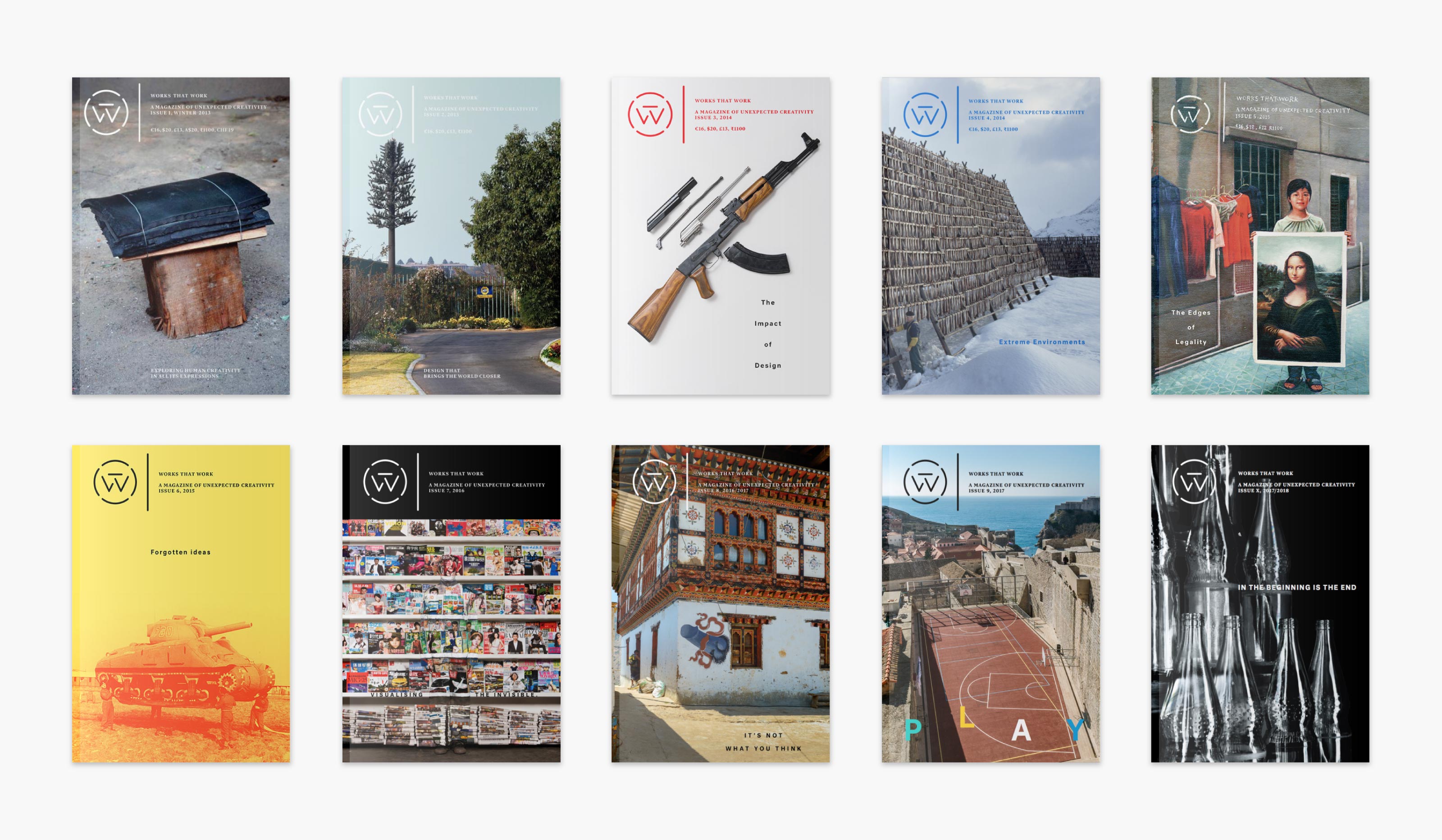
Works That Work is an international magazine for the curious mind, intending to surprise its readers with a rich mix of diverse subjects connected by the theme of unexpected creativity that improves our lives.
The logo started as a quickly drawn placeholder but eventually stuck for the whole 10-issue run of the magazine. The geometric stencilled monogram contains letters W and T.
| Date: | Aug 2012 |
| Client: | Works That Work, NL |
| Art Direction: | Peter Biľak, NL |