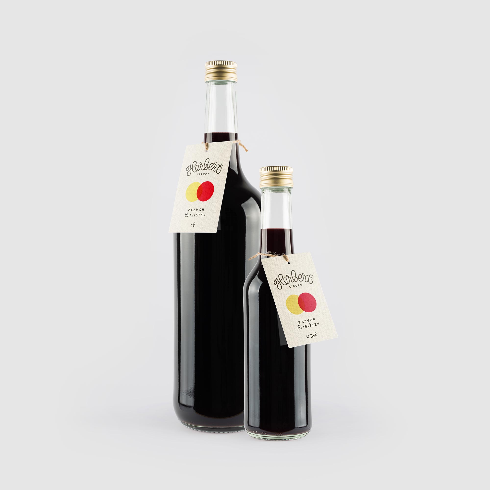
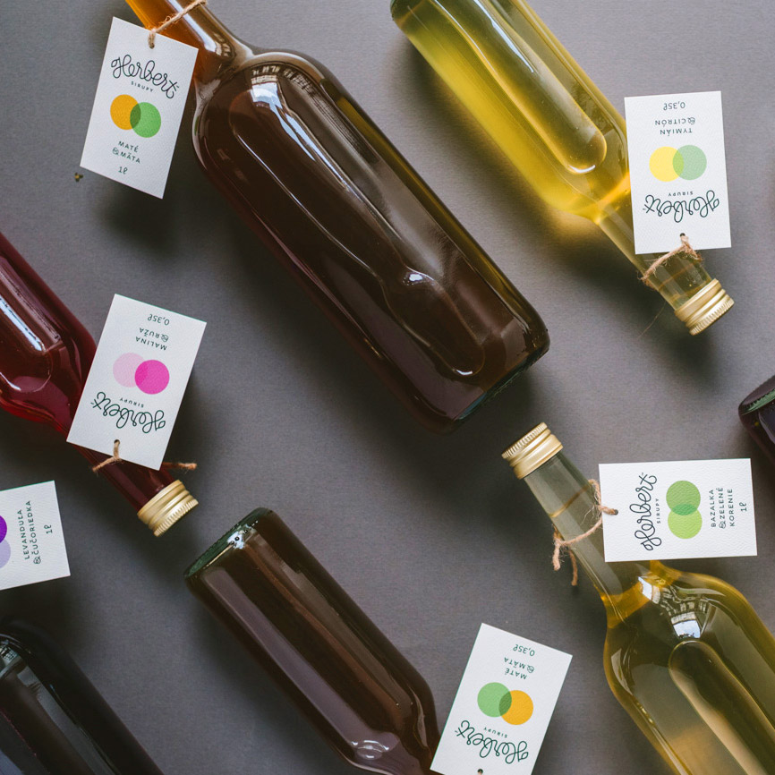
Herbert Sirups
Branding2016
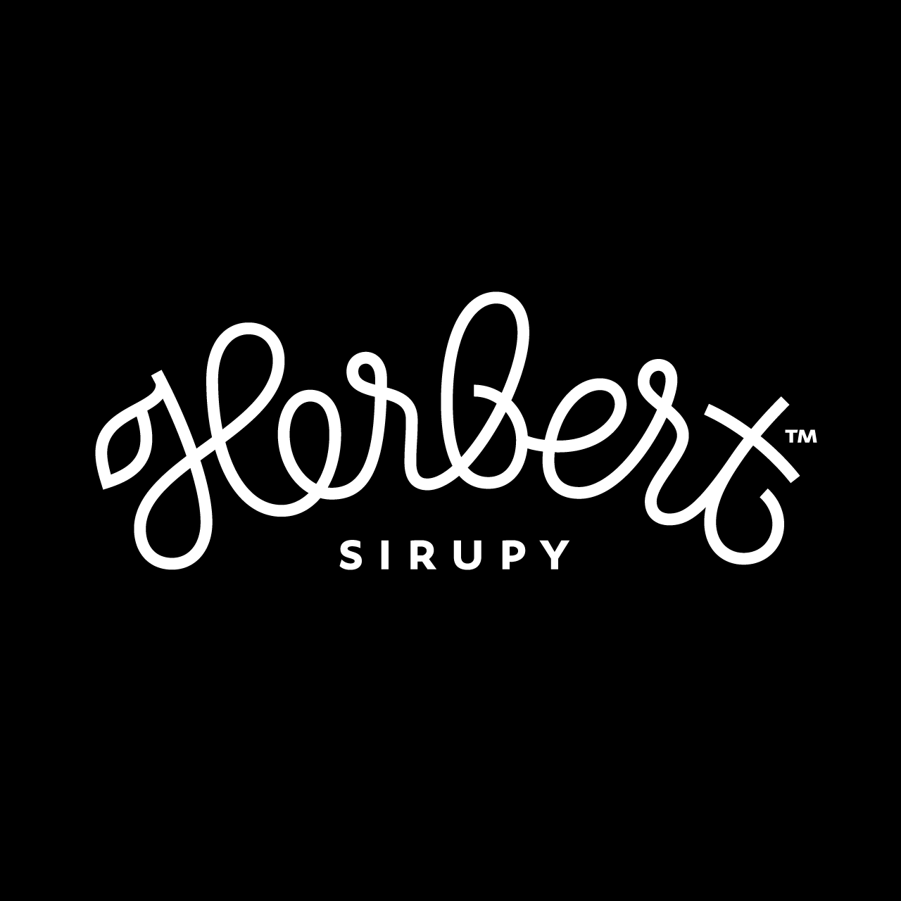
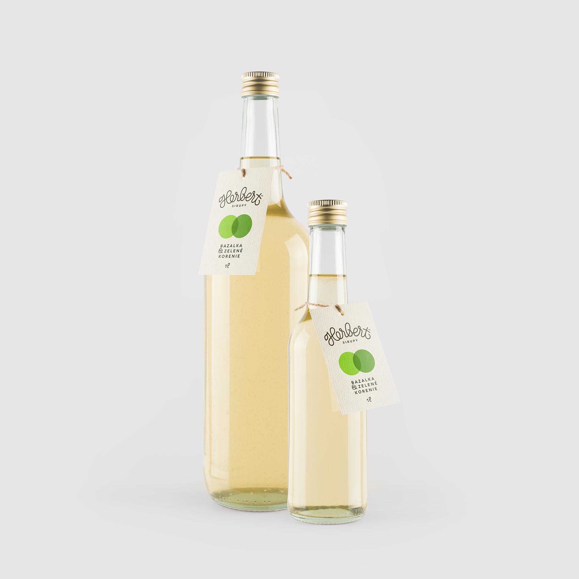
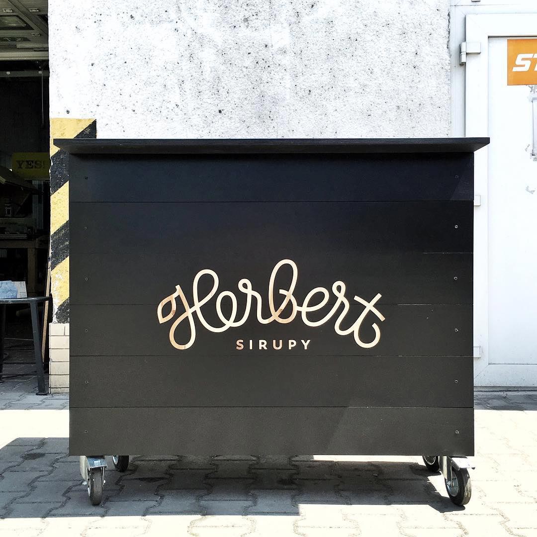
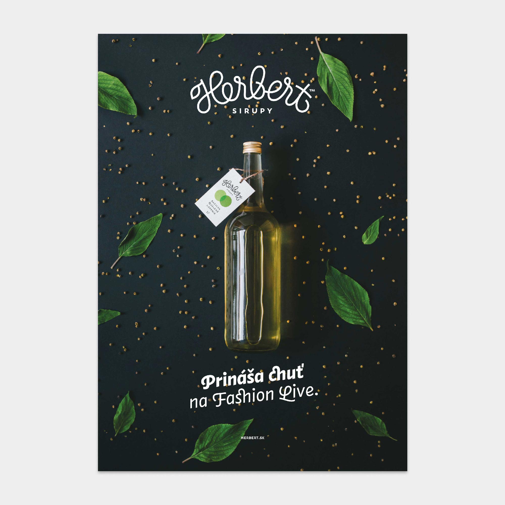
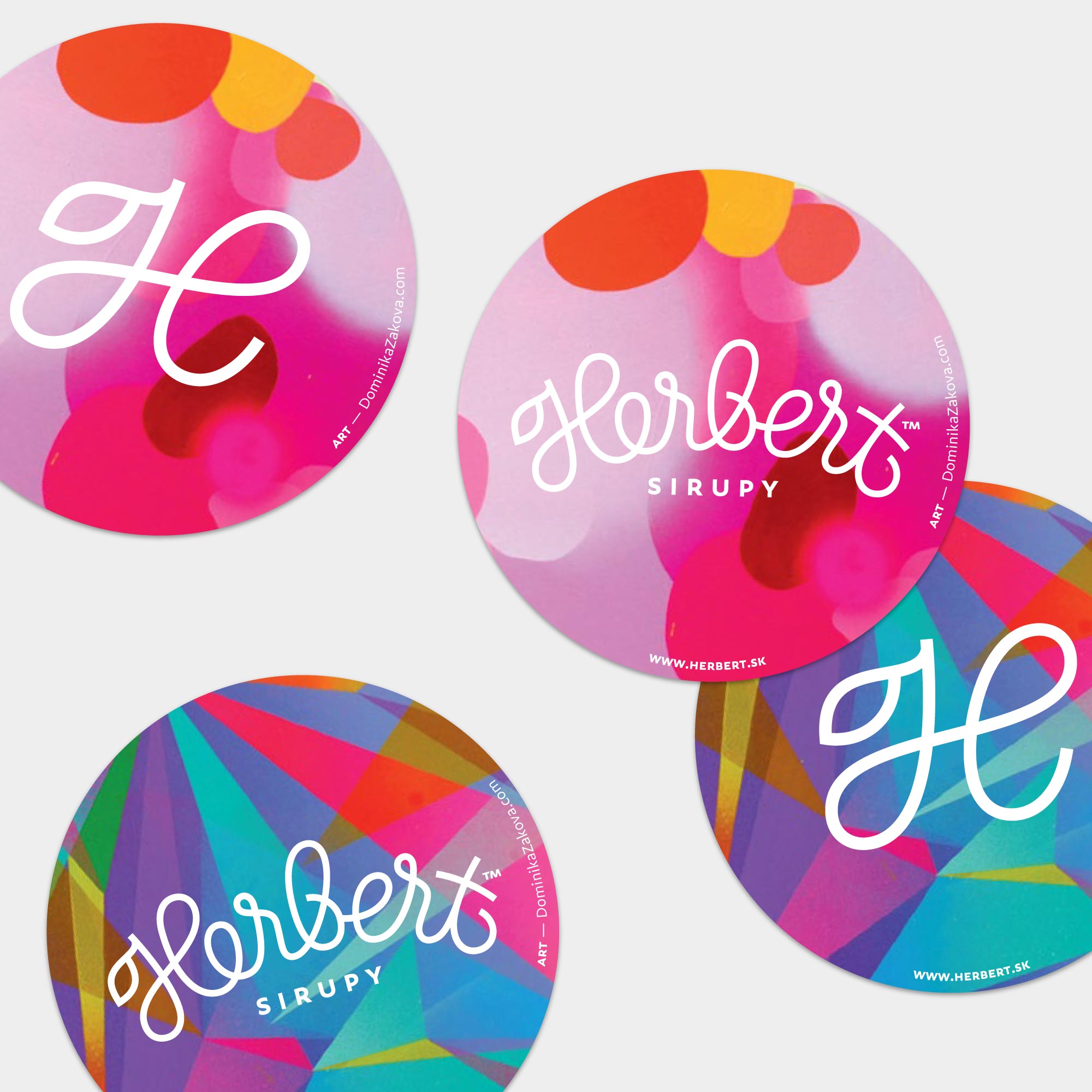
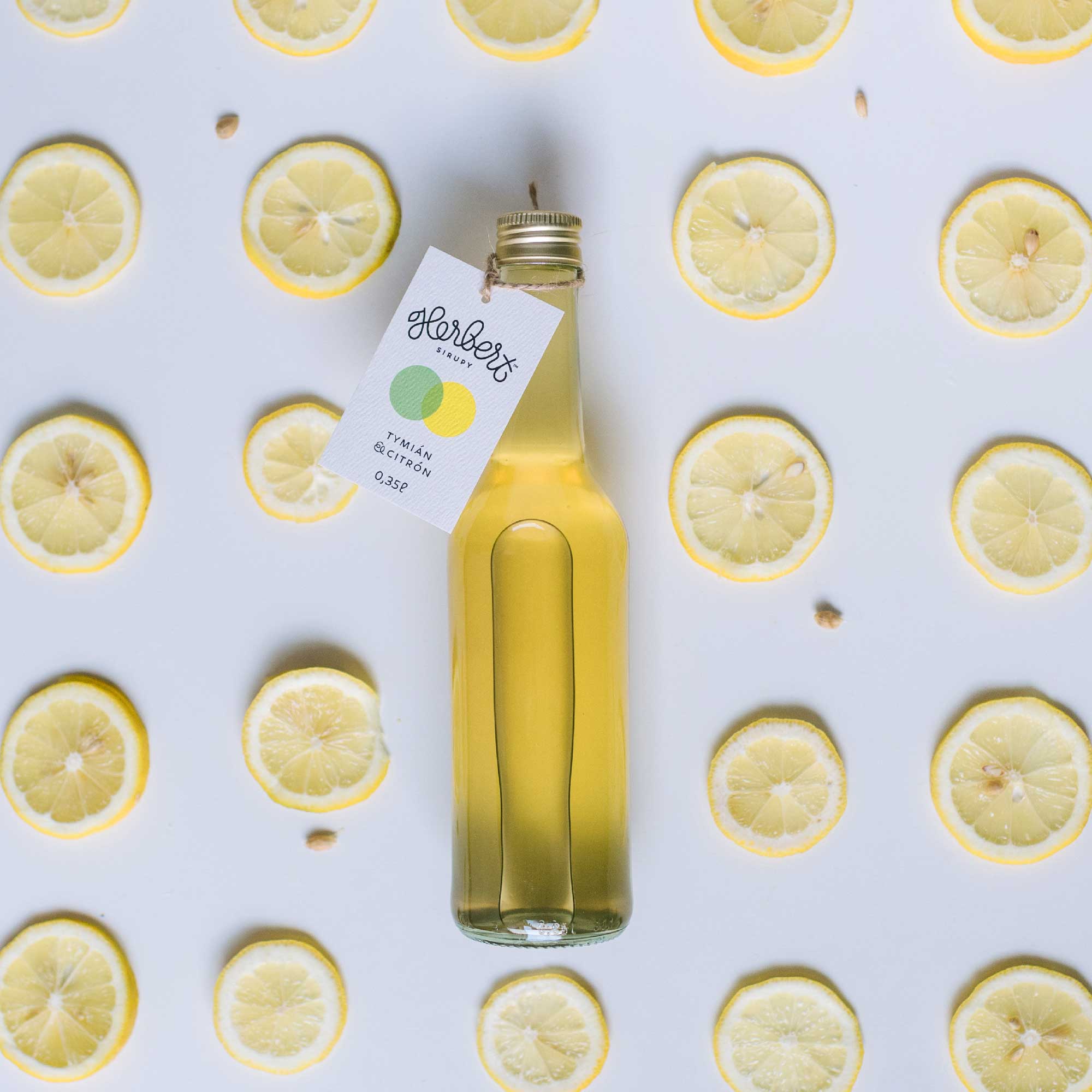
Logo for Herbert, a Slovak producer of strictly natural homemade syrups with flavors you haven’t tasted yet!
The script lettering logo is a redesign of the original hand-drawn logo. The task of the new logo was to present Herbert as a more mature company, while retaining its playfulness and organic feeling. The herb, as one of the main ingredients of Herbert syrups, is part of the initial letter H in the form of a stylized leaf.
| Date: | Jun 2016 |
| Client: | Herbert, SK |
| Project Management: | Zuzana Fajta, SK |