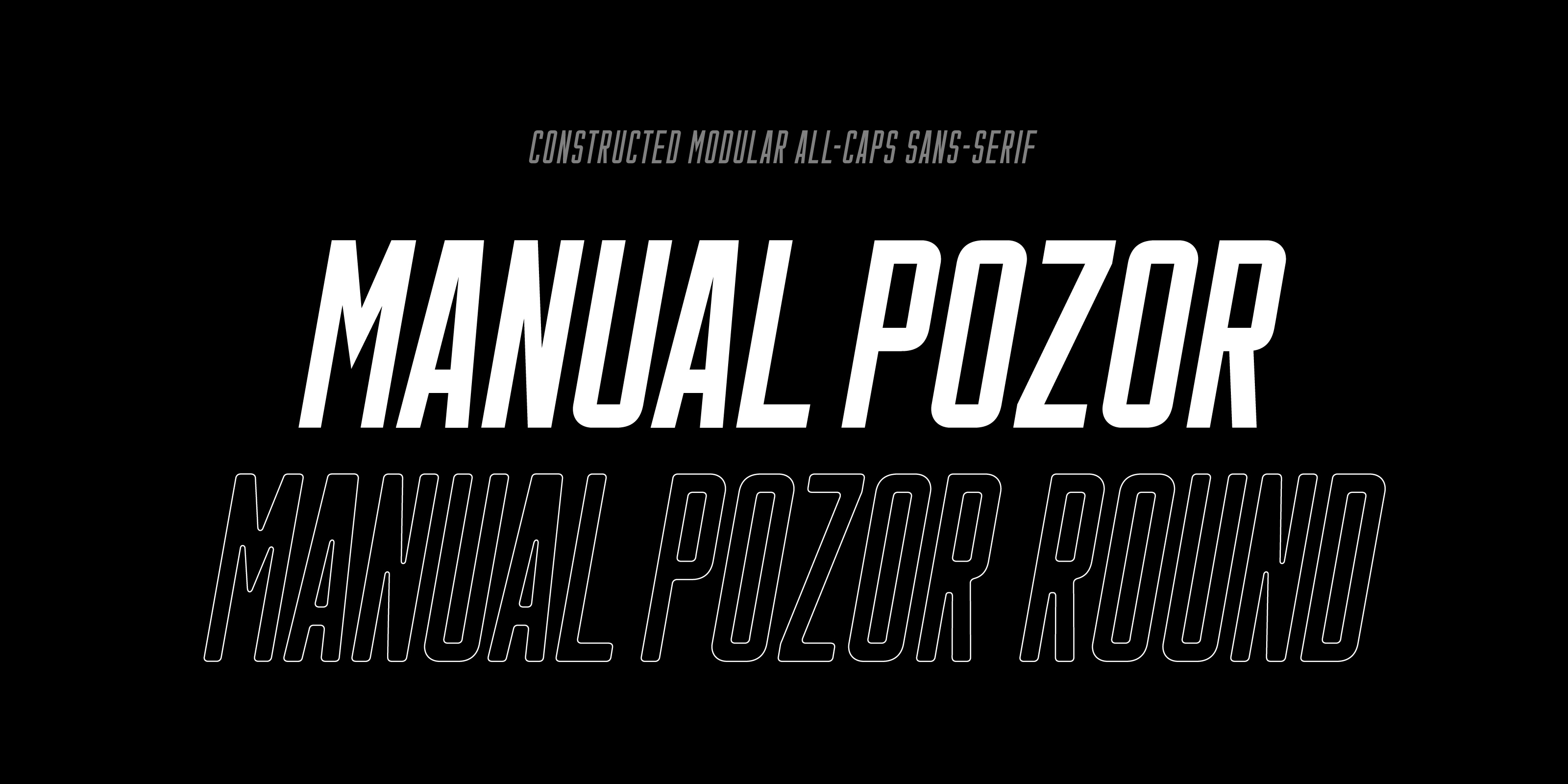
- ManualPozor
- 200Thin300Light400Regular500Medium600Bold800Black900Ultra
-
Genuinely
ImpressiveLight 
-
COOBlack
-
Ultra
- 900 UltraMetalic Alloy200 ThinChemical Composition800 BlackHigh-Quality Steel Production300 LightMeticulously crafted products tailored to meet
the exacting requirements of various industries. -
200O300O400O500O600O800O900O

- Regular 23 px
Die Erde ist der dichteste, fünftgrößte und der Sonne drittnächste Planet des Sonnensystems. Sie ist Ursprungsort und Heimat aller bekannten Lebewesen. Ihr Durchmesser beträgt mehr als 12.700 Kilometer und ihr Alter etwa 4,6 Milliarden Jahre. Nach ihrer vorherrschenden geochemischen Beschaffenheit wurde der Begriff der „erdähnlichen Planeten“ geprägt. Da die Erdoberfläche zu etwa zwei Dritteln aus Wasser besteht und daher die Erde vom All betrachtet vorwiegend blau erscheint, wird sie auch Blauer Planet genannt. Sie wird metaphorisch auch als „Raumschiff Erde“ bezeichnet.
Bold 23 pxDie Erde ist der dichteste, fünftgrößte und der Sonne drittnächste Planet des Sonnensystems. Sie ist Ursprungsort und Heimat aller bekannten Lebewesen. Ihr Durchmesser beträgt mehr als 12.700 Kilometer und ihr Alter etwa 4,6 Milliarden Jahre. Nach ihrer vorherrschenden geochemischen Beschaffenheit wurde der Begriff der „erdähnlichen Planeten“ geprägt. Da die Erdoberfläche zu etwa zwei Dritteln aus Wasser besteht und daher die Erde vom All betrachtet vorwiegend blau erscheint, wird sie auch Blauer Planet genannt. Sie wird metaphorisch auch als „Raumschiff Erde“ bezeichnet.
-
In the labyrinth of forgotten memories, holographic ghosts chant the dirge of lost civilizations.
Thin 50 px -
53Medium
- Thin 16 px
Die Erde ist der dichteste, fünftgrößte und der Sonne drittnächste Planet des Sonnensystems. Sie ist Ursprungsort und Heimat aller bekannten Lebewesen. Ihr Durchmesser beträgt mehr als 12.700 Kilometer und ihr Alter etwa 4,6 Milliarden Jahre. Nach ihrer vorherrschenden geochemischen Beschaffenheit wurde der Begriff der „erdähnlichen Planeten“ geprägt. Da die Erdoberfläche zu etwa zwei Dritteln aus Wasser besteht und daher die Erde vom All betrachtet vorwiegend blau erscheint, wird sie auch Blauer Planet genannt. Sie wird metaphorisch auch als „Raumschiff Erde“ bezeichnet.
Black 16 pxDie Erde ist der dichteste, fünftgrößte und der Sonne drittnächste Planet des Sonnensystems. Sie ist Ursprungsort und Heimat aller bekannten Lebewesen. Ihr Durchmesser beträgt mehr als 12.700 Kilometer und ihr Alter etwa 4,6 Milliarden Jahre. Nach ihrer vorherrschenden geochemischen Beschaffenheit wurde der Begriff der „erdähnlichen Planeten“ geprägt. Da die Erdoberfläche zu etwa zwei Dritteln aus Wasser besteht und daher die Erde vom All betrachtet vorwiegend blau erscheint, wird sie auch Blauer Planet genannt. Sie wird metaphorisch auch als „Raumschiff Erde“ bezeichnet.
- 200 ThinGloveboxes300 LightGloveboxes400 RegularGloveboxes500 MediumGloveboxes600 BoldGloveboxes800 BlackGloveboxes900 UltraGloveboxes
-
MOVMedium
- Light 17 px
Die Erde ist der dichteste, fünftgrößte und der Sonne drittnächste Planet des Sonnensystems. Sie ist Ursprungsort und Heimat aller bekannten Lebewesen. Ihr Durchmesser beträgt mehr als 12.700 Kilometer und ihr Alter etwa 4,6 Milliarden Jahre. Nach ihrer vorherrschenden geochemischen Beschaffenheit wurde der Begriff der „erdähnlichen Planeten“ geprägt. Da die Erdoberfläche zu etwa zwei Dritteln aus Wasser besteht und daher die Erde vom All betrachtet vorwiegend blau erscheint, wird sie auch Blauer Planet genannt. Sie wird metaphorisch auch als „Raumschiff Erde“ bezeichnet.
Medium 17 pxDie Erde ist der dichteste, fünftgrößte und der Sonne drittnächste Planet des Sonnensystems. Sie ist Ursprungsort und Heimat aller bekannten Lebewesen. Ihr Durchmesser beträgt mehr als 12.700 Kilometer und ihr Alter etwa 4,6 Milliarden Jahre. Nach ihrer vorherrschenden geochemischen Beschaffenheit wurde der Begriff der „erdähnlichen Planeten“ geprägt. Da die Erdoberfläche zu etwa zwei Dritteln aus Wasser besteht und daher die Erde vom All betrachtet vorwiegend blau erscheint, wird sie auch Blauer Planet genannt. Sie wird metaphorisch auch als „Raumschiff Erde“ bezeichnet.
-
Laws
of
ThermodynamicsUltra -

-
Mystery
of TimeBold 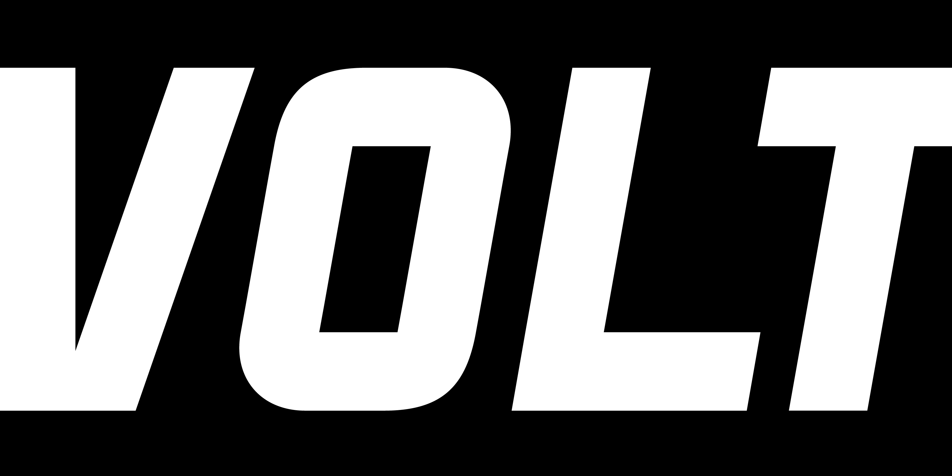
About
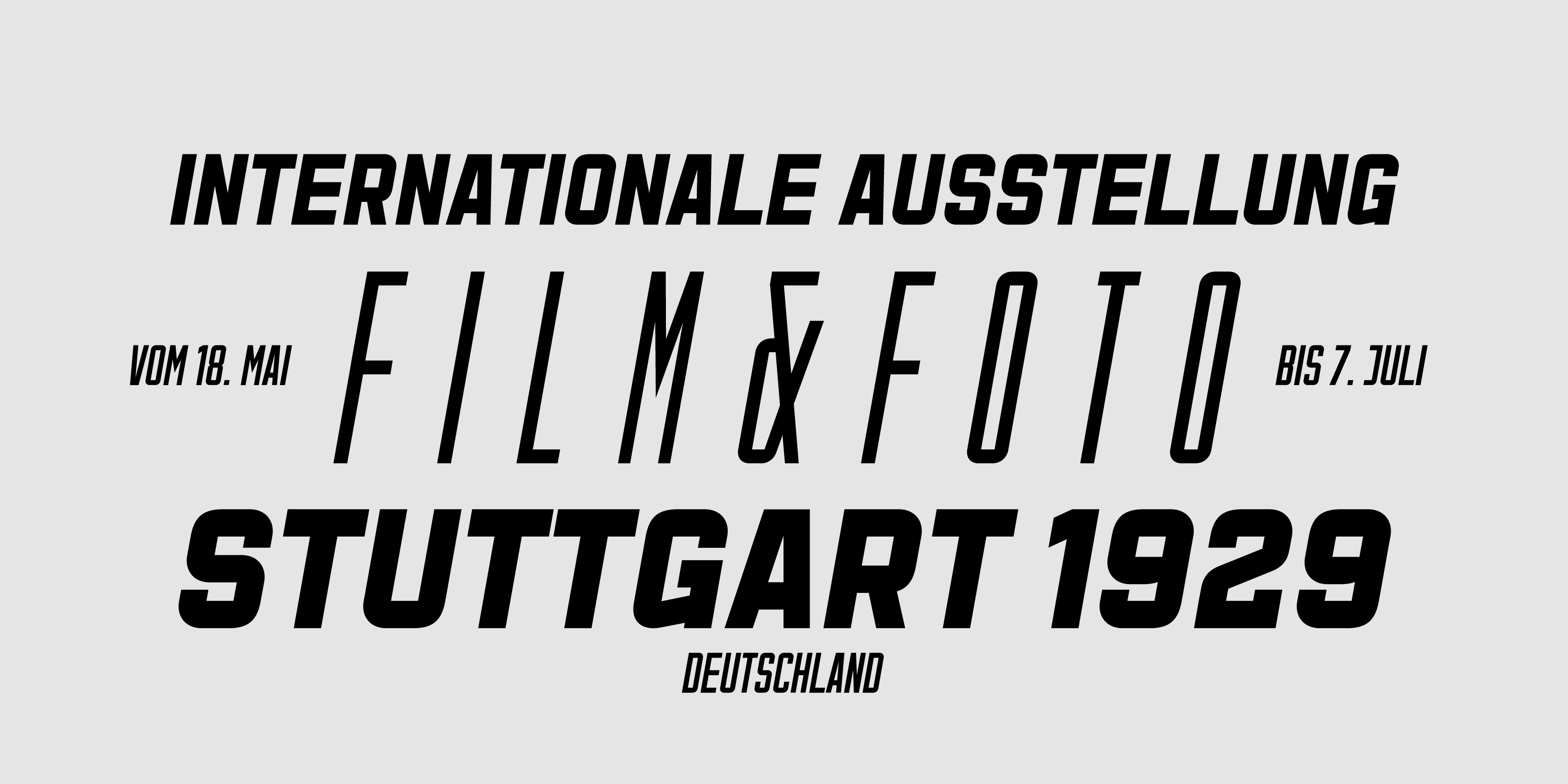
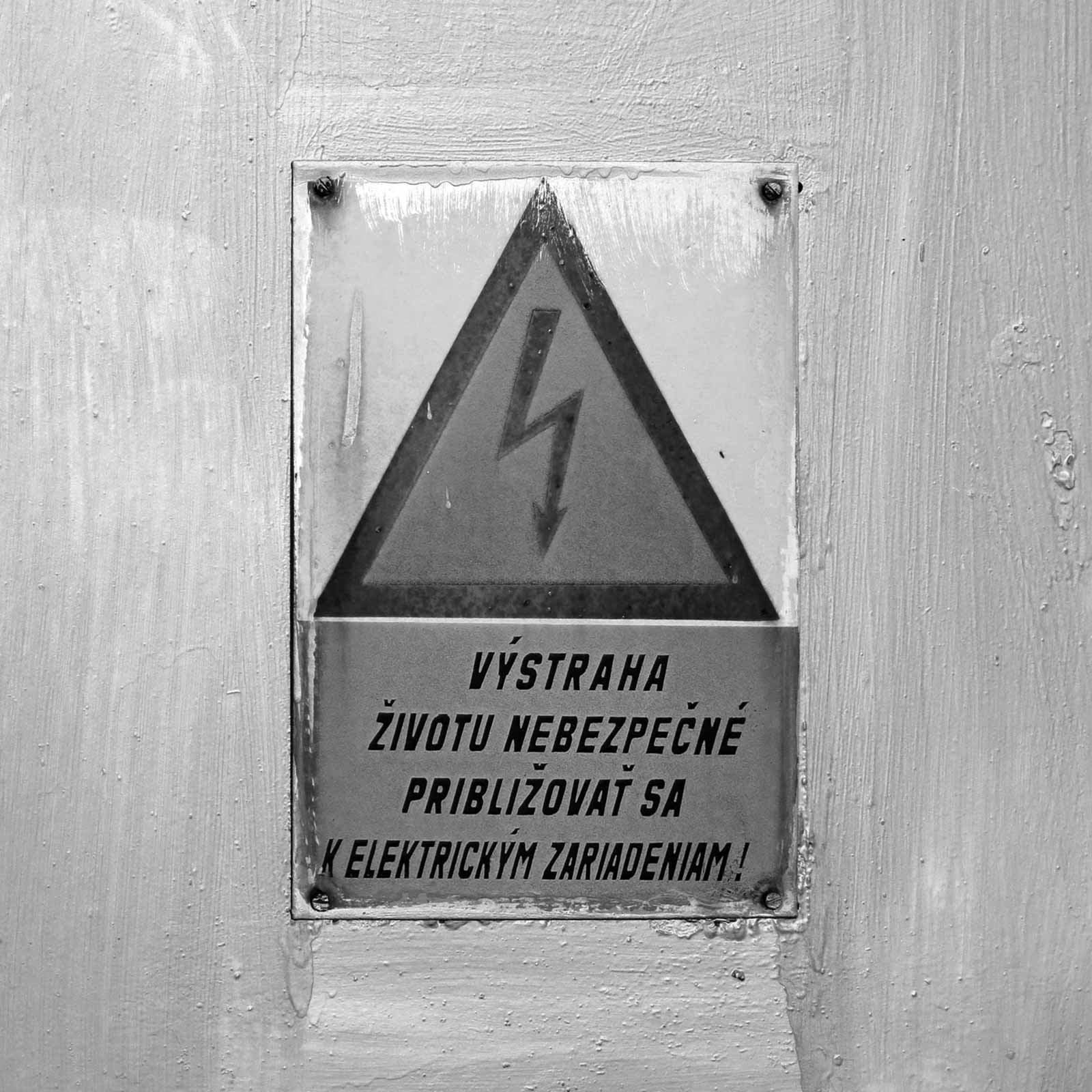
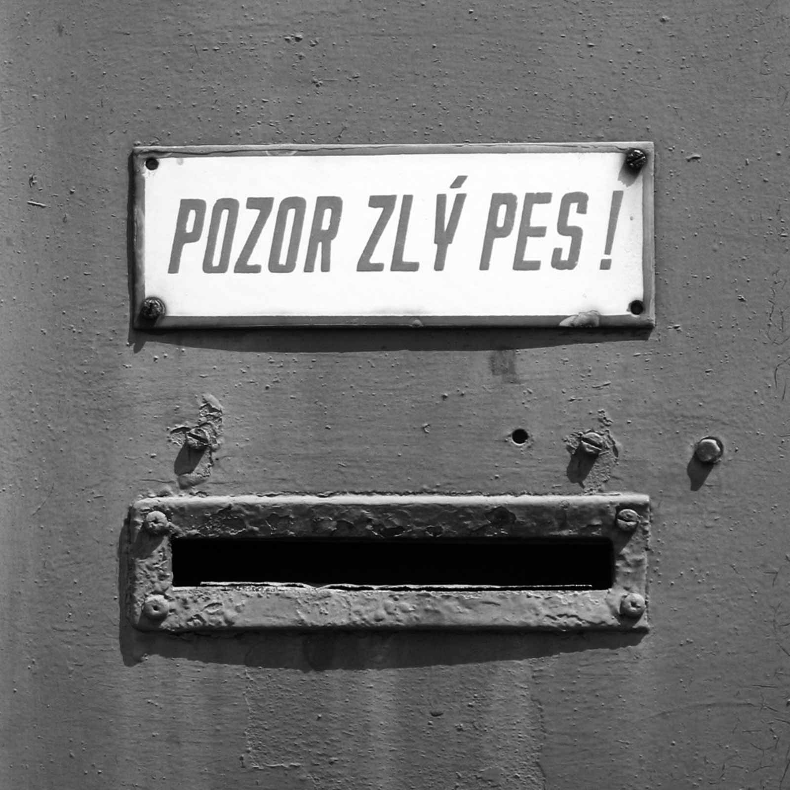
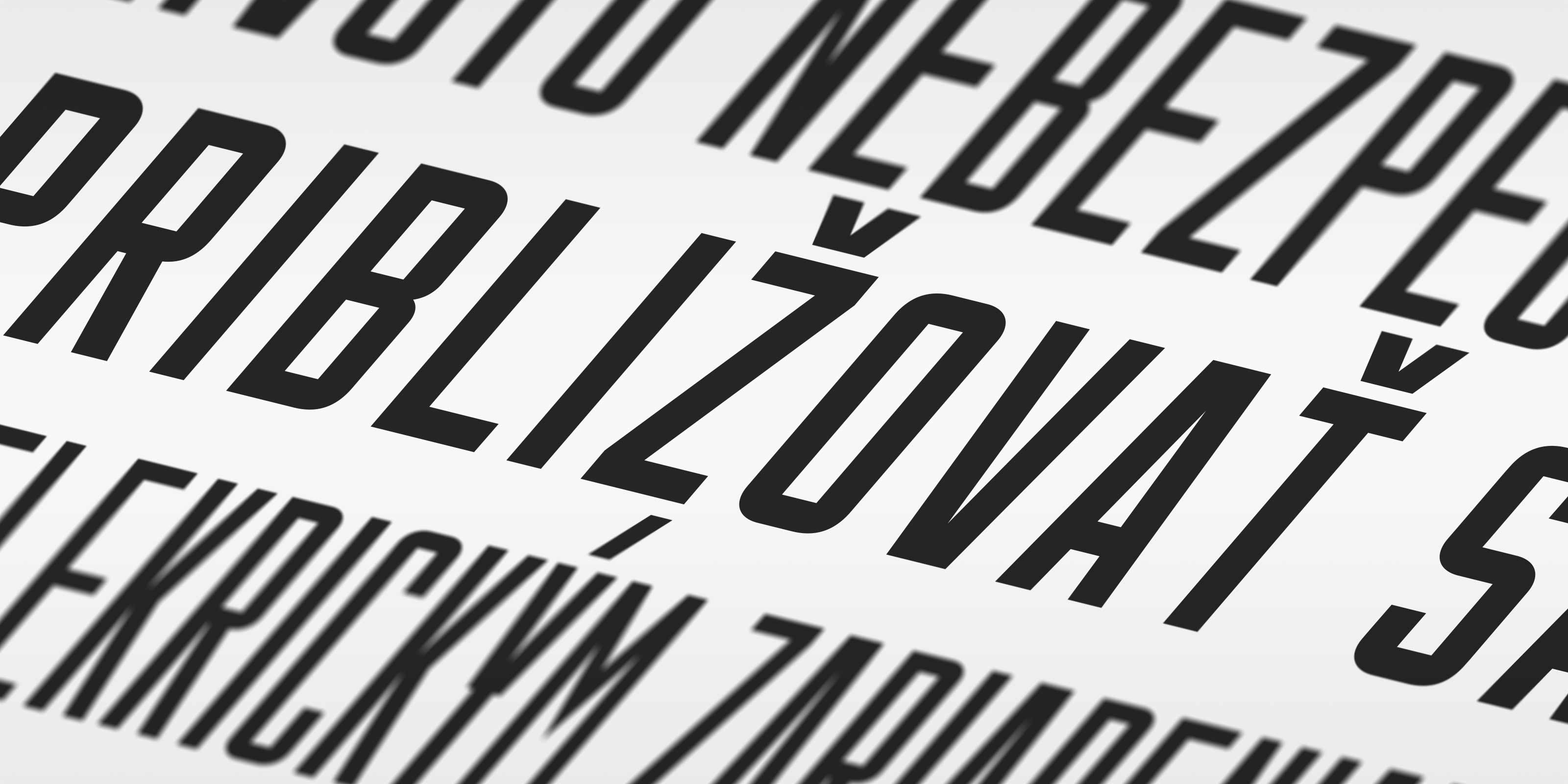
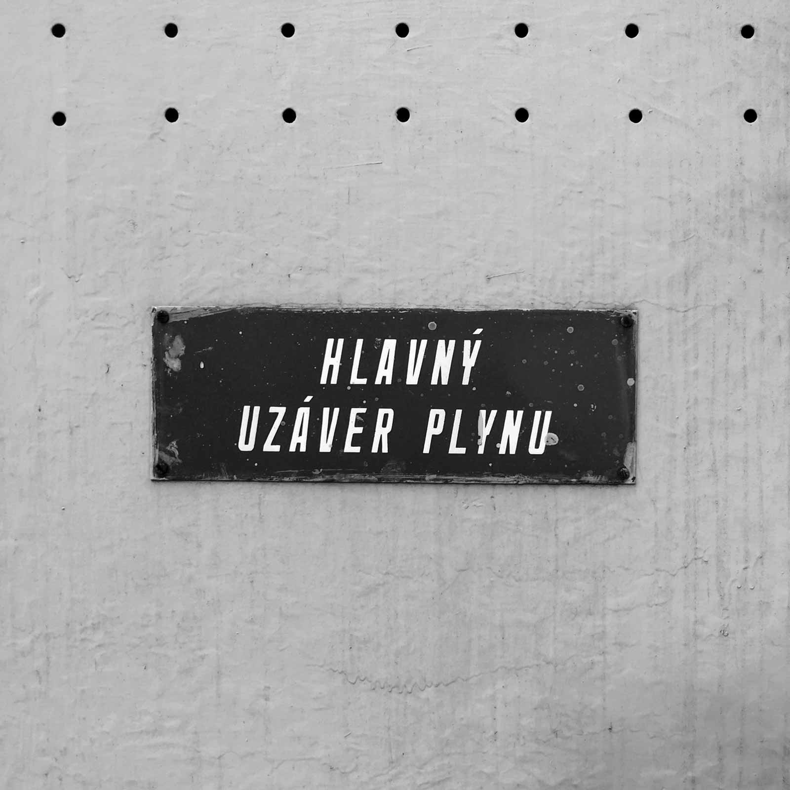
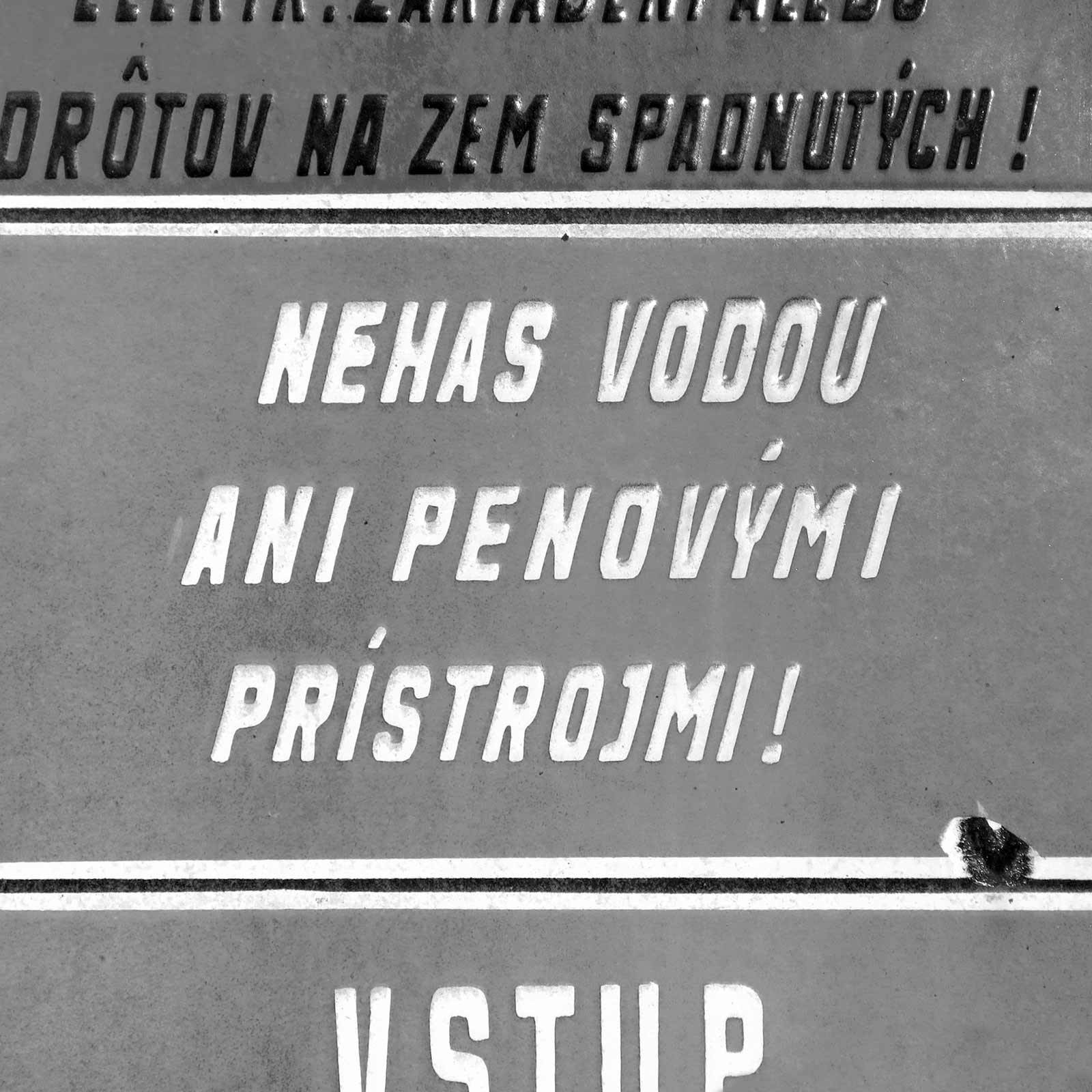
The typeface from warning sings, as it was drawn on paper.
Manual Pozor (Slovak for “warning”) is a digitization of the typeface from old Slovak warning signs. It is an oblique version of Manual Grotesk B, with slightly larger radius of its arcs.
The upright and oblique styles of Manual Grotesk were never used together on a single sign – the upright Manual Grotesk was used to mark streets and buildings and the oblique variant was used exclusively on warning signs.
Because of the size of the letters on these signs – usually they had longer texts – small details and sharp corners were rounded off in the enamel production process. However, Manual Pozor preserves these details and presents them just like they were drawn on stencils by the original sign designers.
| Styles: | 7 |
| Blocks: | Basic Latin, Extended Latin |
| Languages: | 100 |
| Glyphs: | 237 |
| Figures: | Proportional Lining (Default) |
| Version: | 1.0 |
| Copyright: | Manual Pozor, Ondrej Jób © 2018. All rights reserved. |
| Release Date: | Jun 30 2018 |