- Slovak National Design Award
Comenius University
Custom Fonts2021
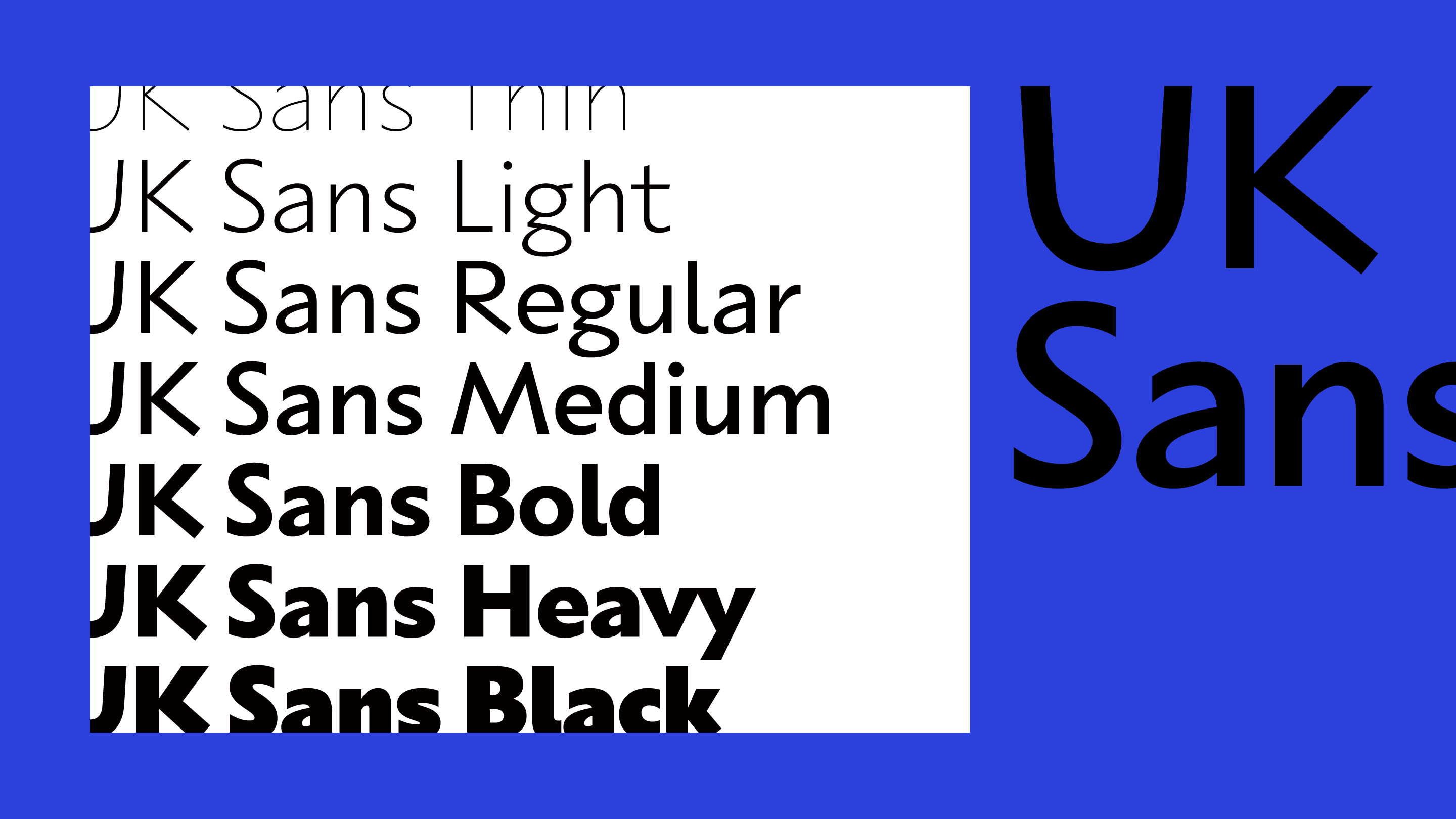
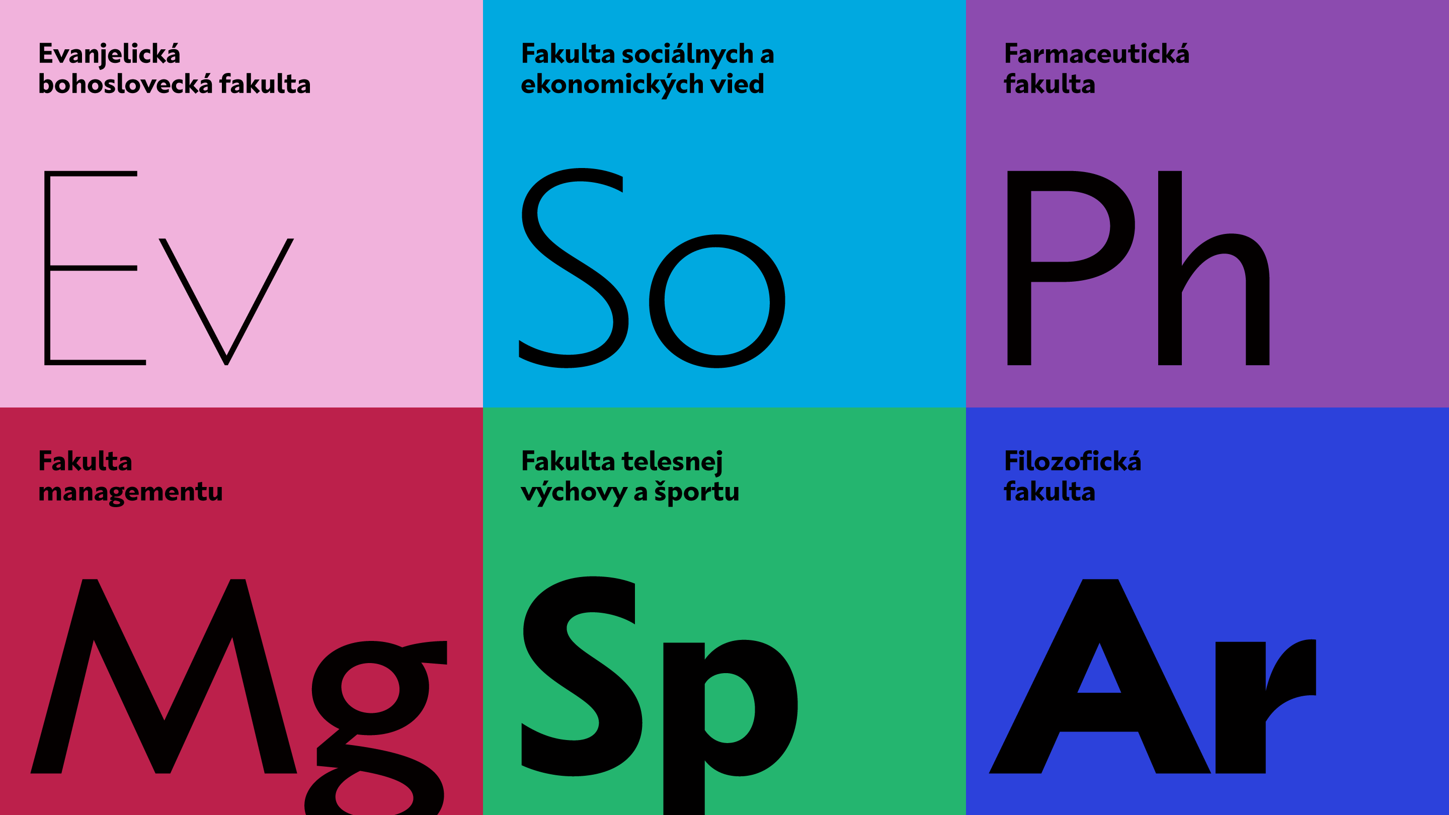
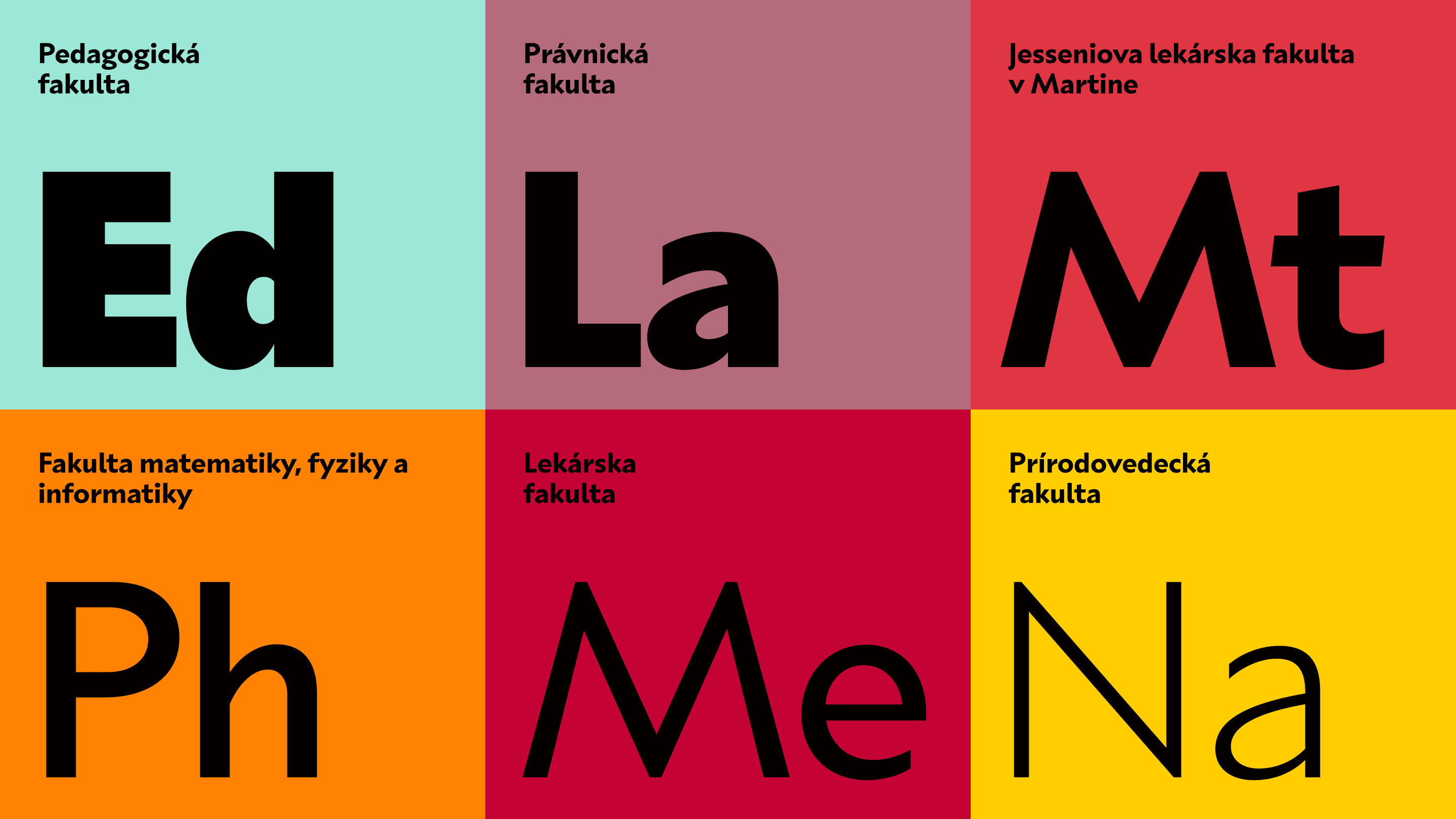
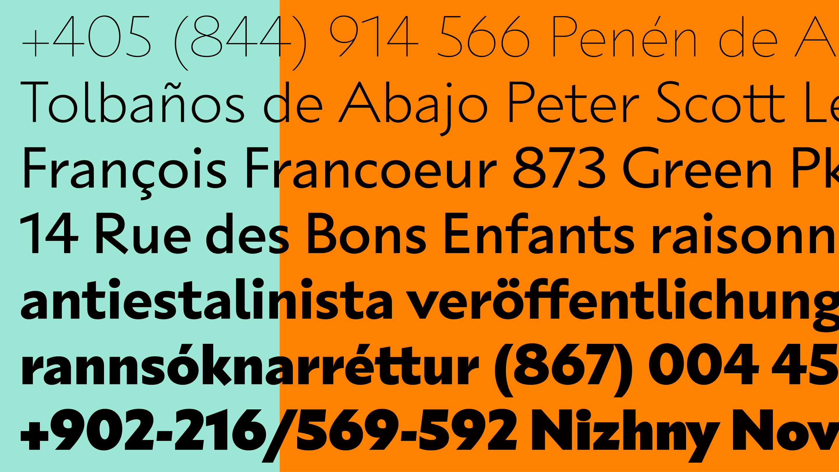
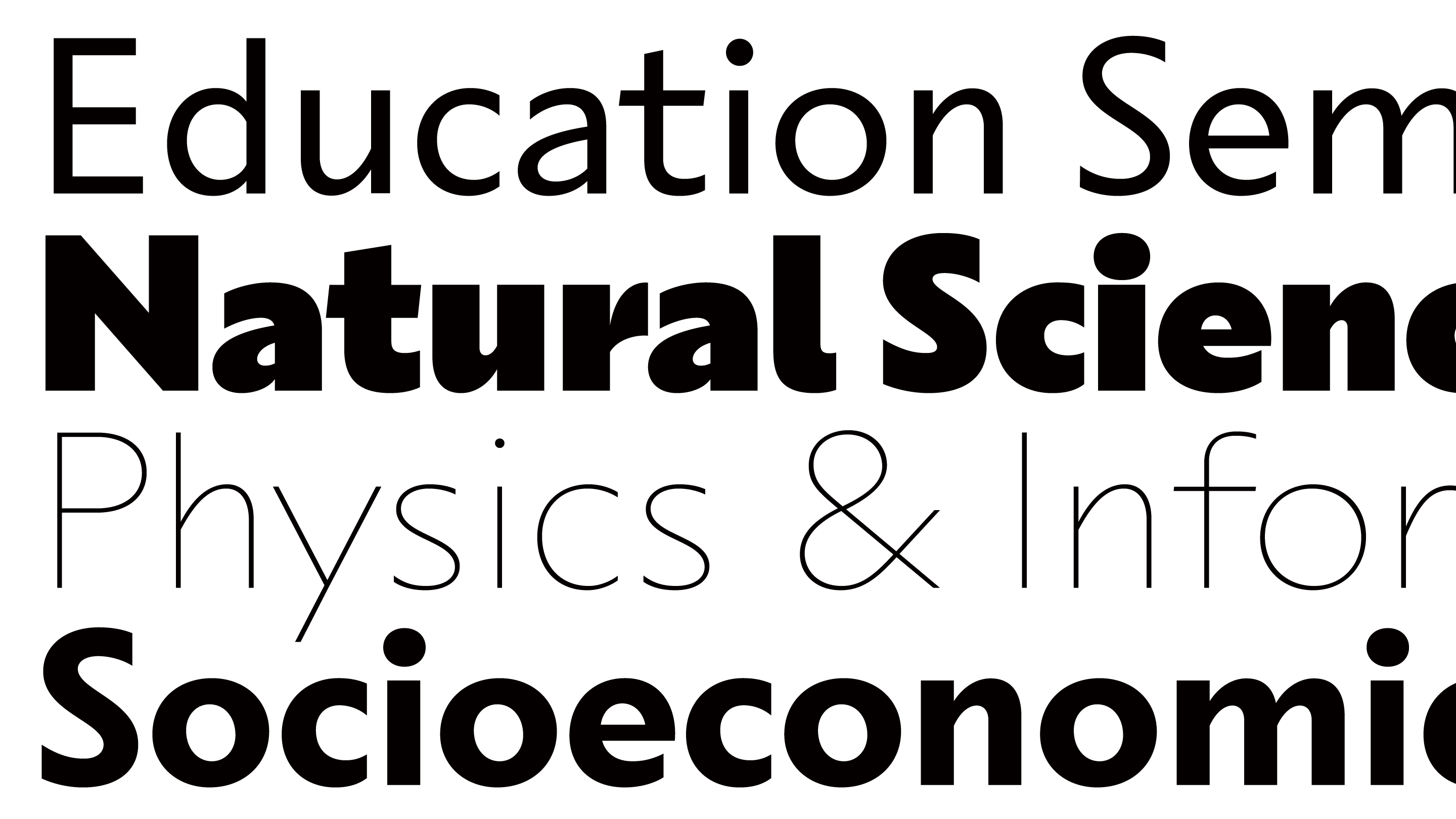
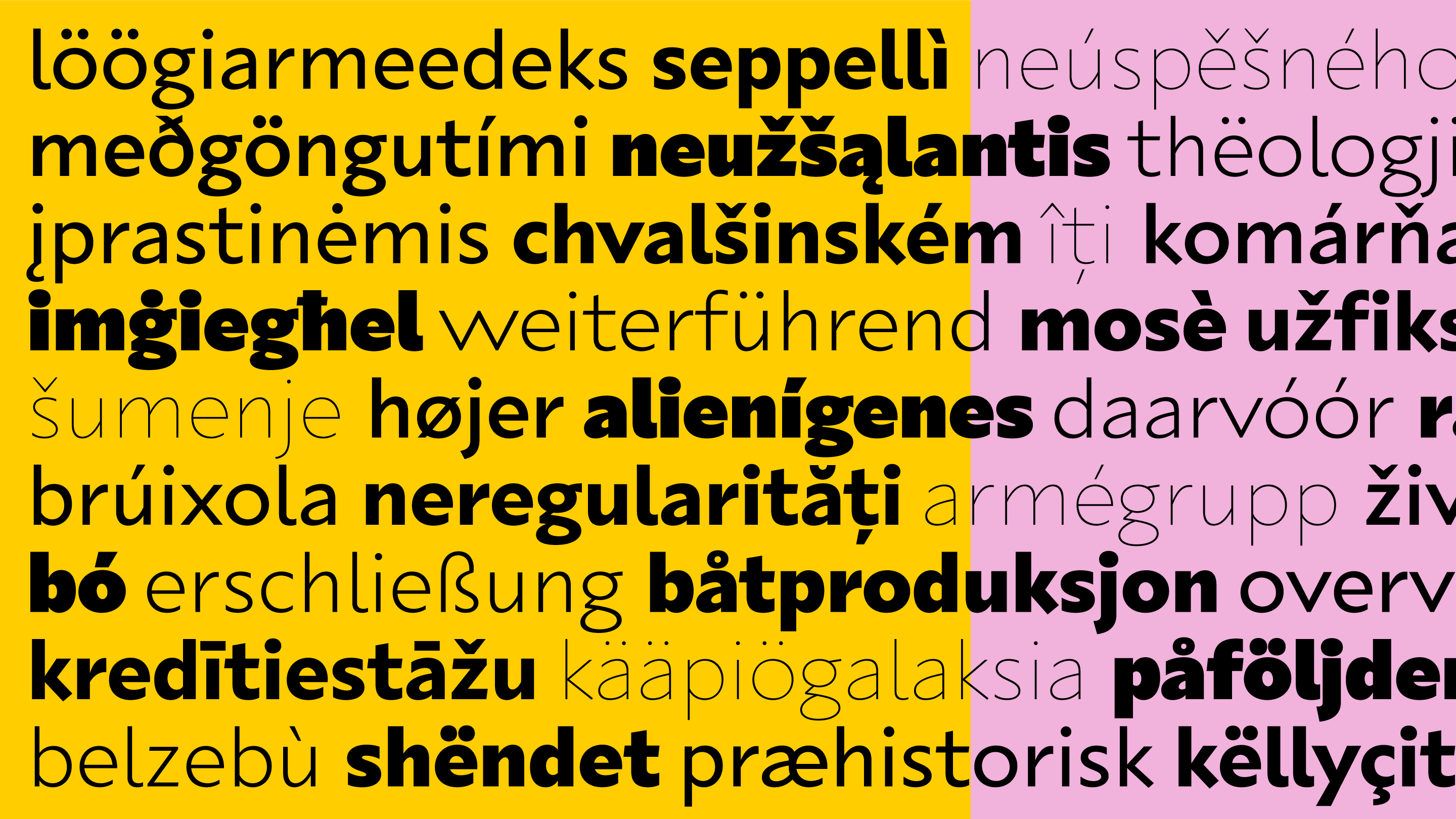
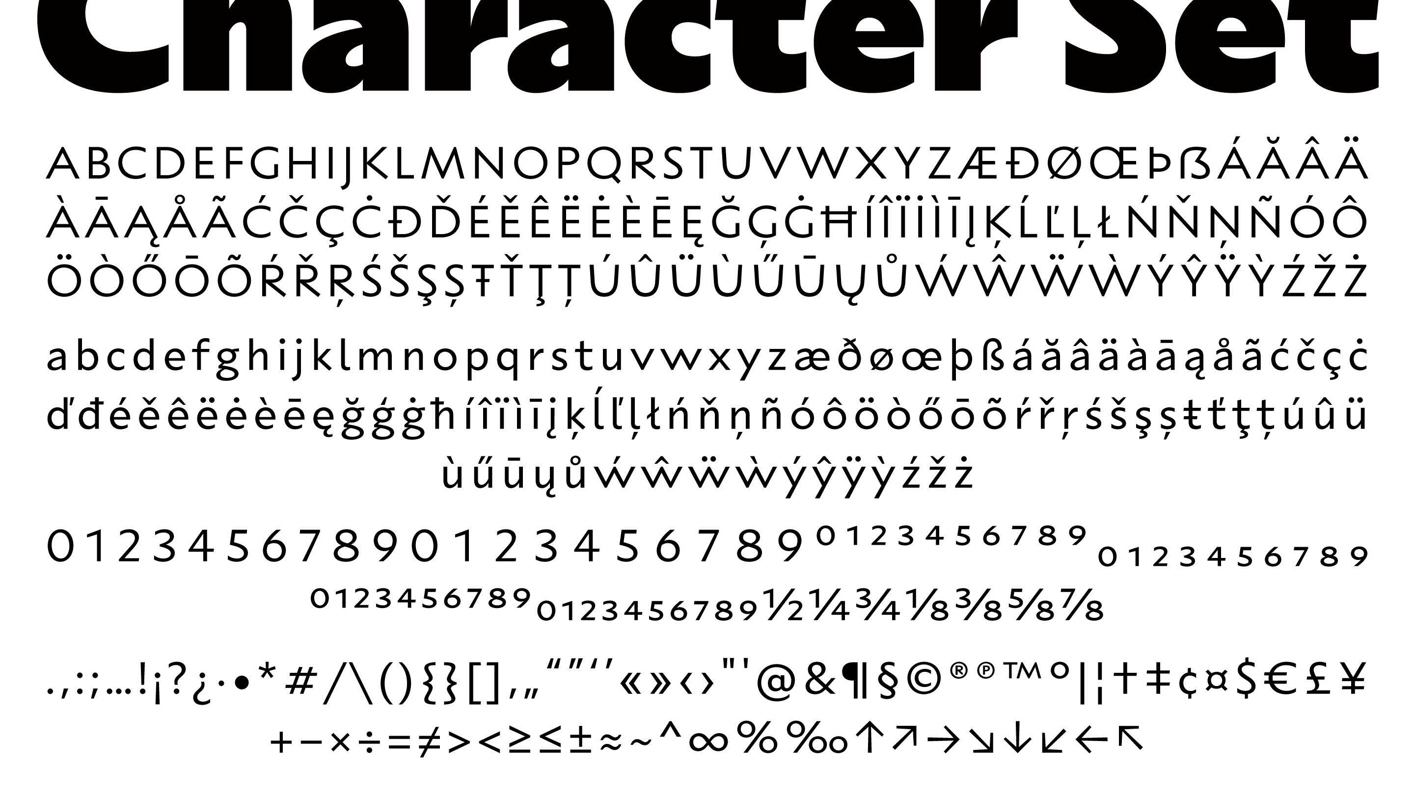
UK Sans is a low contrast sans-serif typeface in seven weights with wide language support, custom designed and developed for usage in the new visual identity of Comenius University in Bratislava.
Its design is based on a combination of various historical and modern influences, of which the most important is Capitalis Monumentalis – the Roman capital. UK Sans adapts its construction and stroke modulation, but also adds calligraphic contrast and other modern elements, such as perpendicular terminals of diagonal strokes and vertical terminals of curved strokes.
Read More ↓| Date: | May 2021 |
| Client: | Comenius University Bratislava, SK |
| Agency: | GoBigname, SK |
-
ThinPREFERENTEMENTE
Puerta Alvarenga, A-57 -
HeavyDECORATIVAMENTE
Ottogasse 88 -
BoldPLETHYSMOGRAPHY
Puerta Luna, 48 -
LightUNGERECHTIGKEIT
2 Rue Marcadet -
BlackREPHOTOGRAPHING
308 Quail St F-47 -
MediumPENNES-MIRABEAU
196 Branch Hollow -
RegularREMEMBERABILITY
218 Foster Park