Project Manual — Part 2: Where did the fonts come from?
| Category: | Manual |
| Published: | Aug 19 2018 |
| By: | Ondrej Jób |
The authors and their publications that laid the foundations for the creation of a typeface that became omnipresent in Czechoslovak streets and graphic design in the second half of the 20th century.
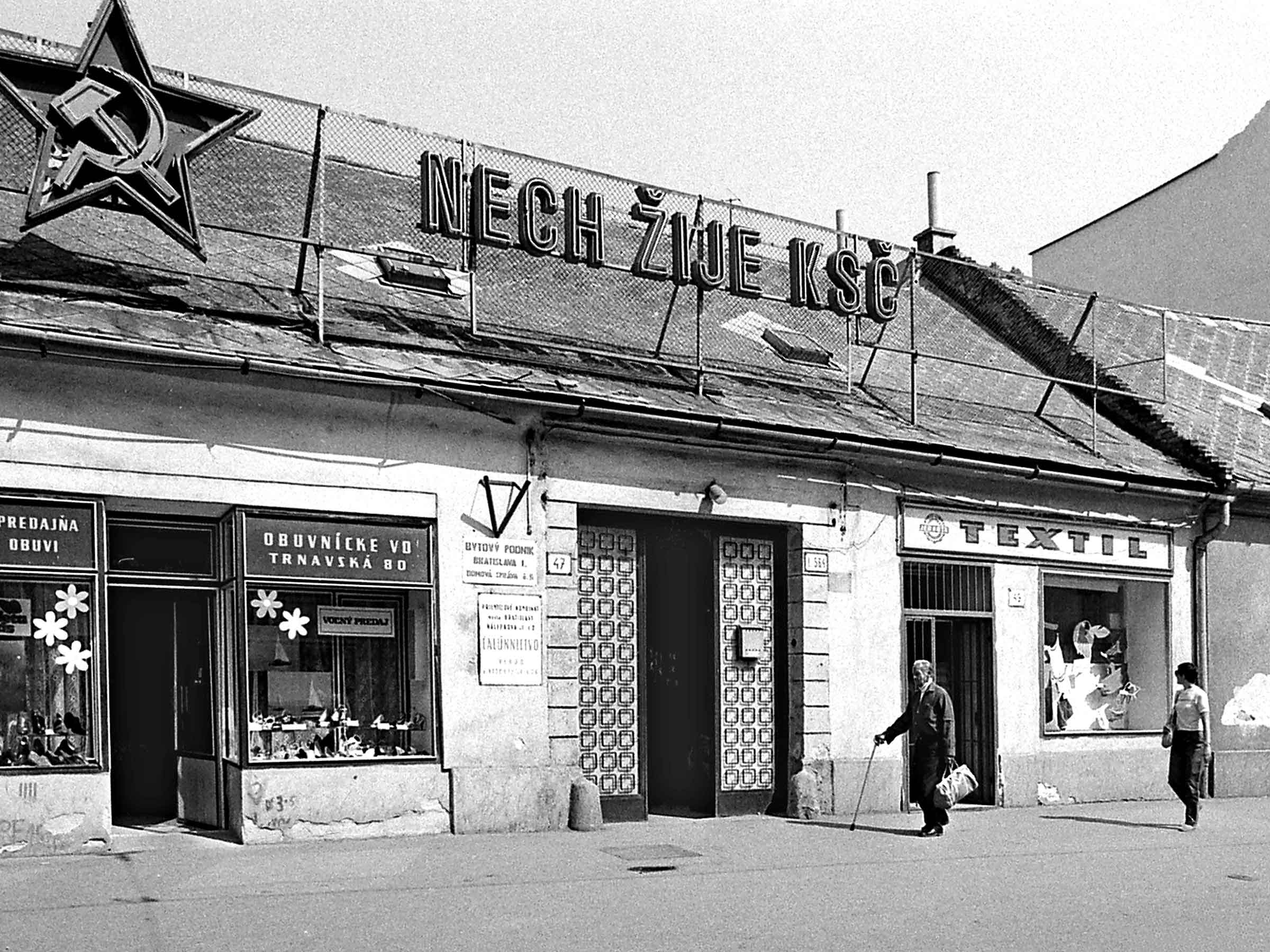
When researching the origin of the fonts from the Manual Grotesk family, it was easy to dig up the black and white images of the previous regime from the memory – no public event, school noticeboard, or shop window could do without slogans about building a better socialist future.
These slogans used fonts of various sizes, widths, and weights, but they all had one thing in common though – except for some formal and proportional exceptions, they were always constructed in the same way, and that applied for all of Czechoslovakia. But it wasn’t just the slogans, the logo of Jednota (a state-run chain of grocery stores) was constructed in the same way, many tombstones and memorials have this font carved in stone, it can be found on many appliances manufactured by the Czechoslovak Tesla factory, it is used on corridors of almost every older hospital or medical facility, on book covers and finally also on the enamel plates with house numbers and street names.
People who created these signs and inscriptions, be it display decorators, industrial designers, graphic designers, or even engineers, have had to learn this unified system for constructing of the letterforms from a single source. As I assumed that there was no standard or directive that would define the design system (which was later confirmed), I decided to focus my search on textbooks for secondary vocational schools, the older, the better.
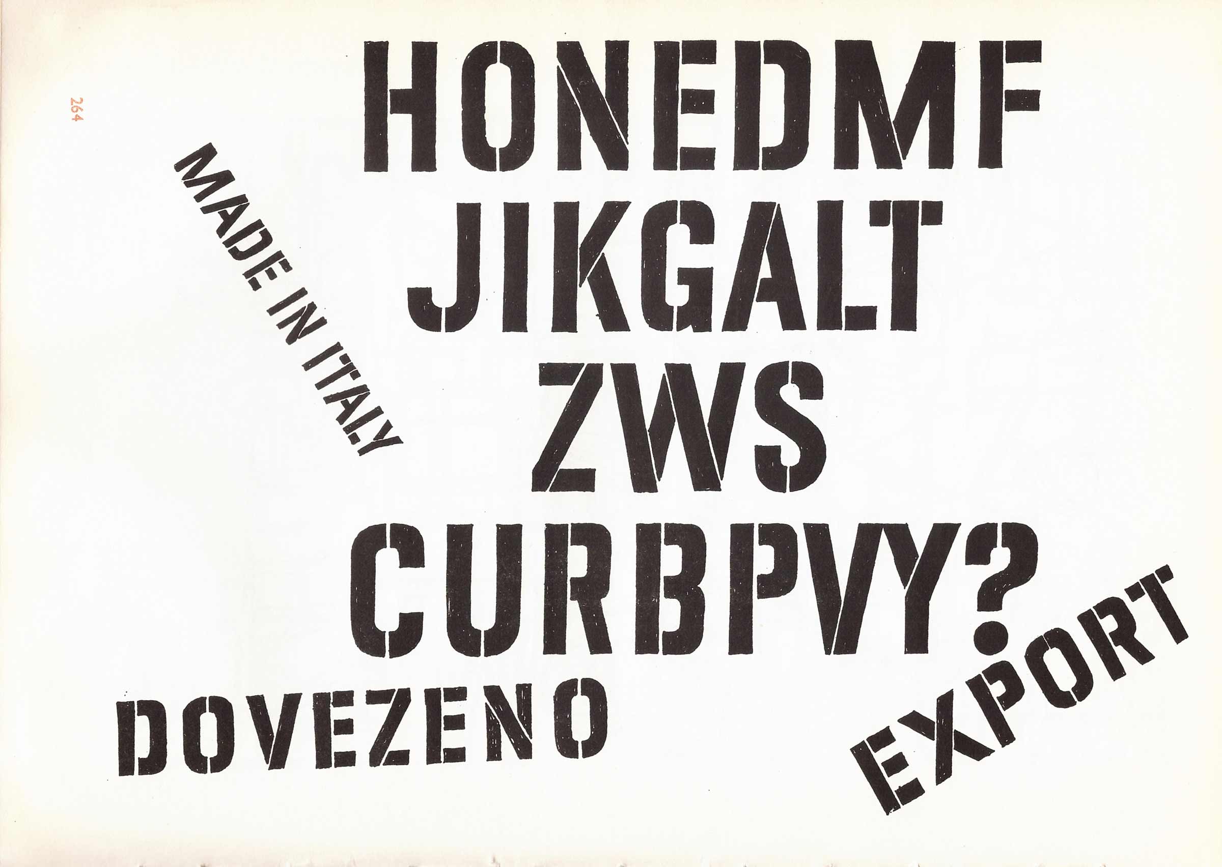
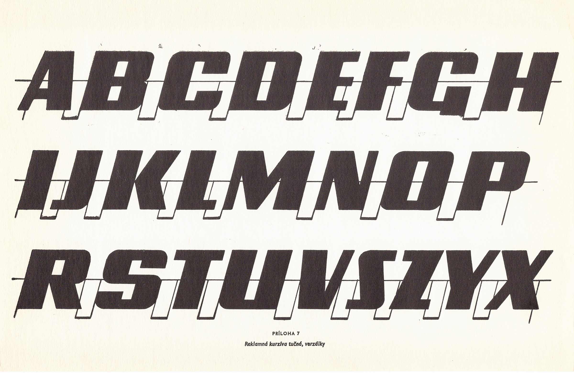
I have discovered several publications with references to this constructed typeface. The first was Písmo v propagaci (Typography in Advertising) written by two authors, Bohumil Lanz and Zdeněk Němeček. Being from 1974, it is the youngest of the books, but is also the only one detailing drawing of a narrow grotesque font not only with writing or painting tools, but also with the use of stencils. There is also a sample of a stencilled version suitable for application via spraying or stippling.
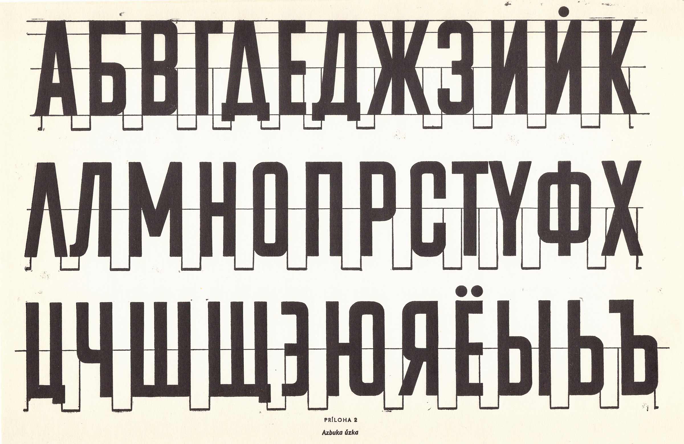
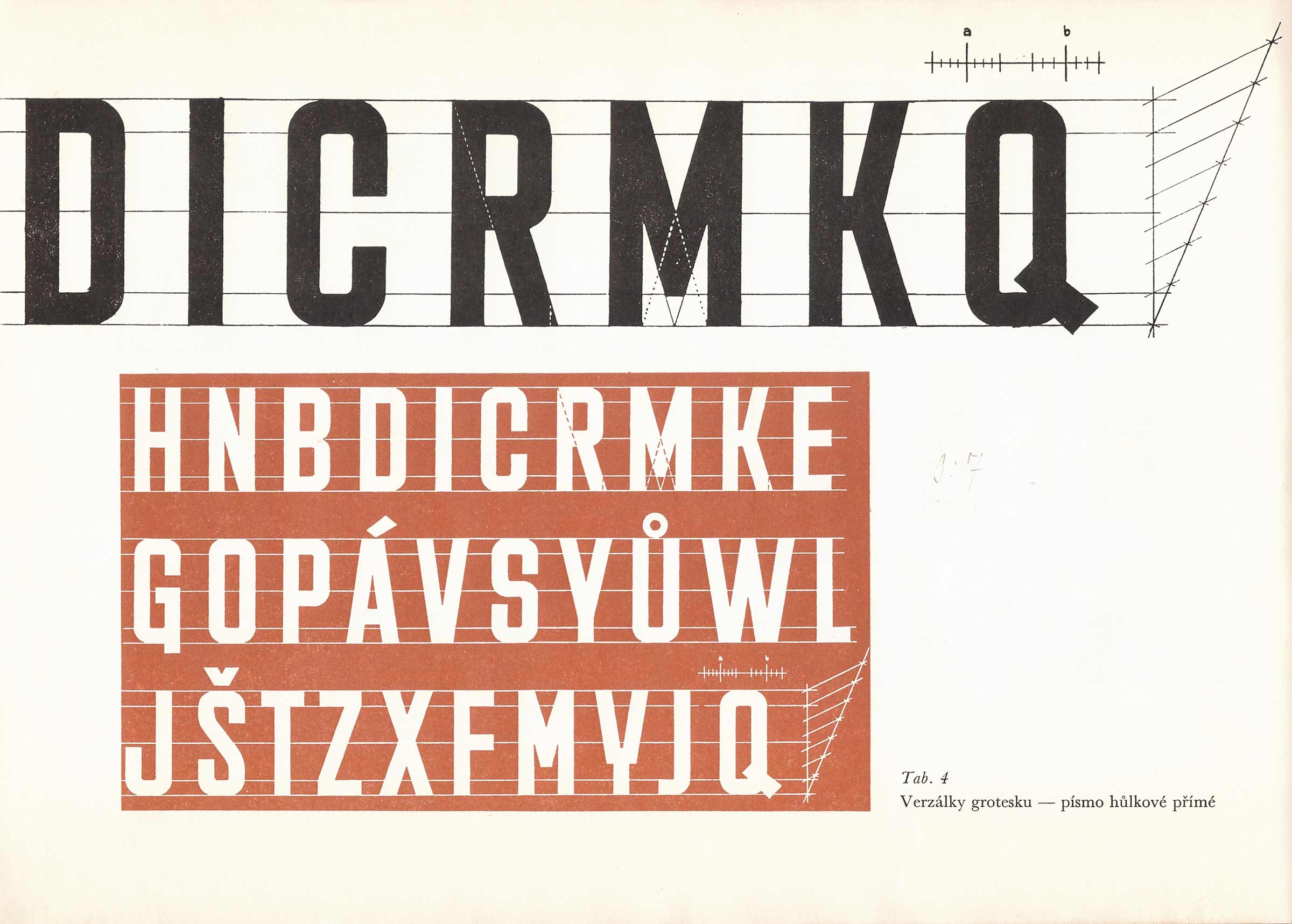
Another found publication was Metodika tvorby a radenia písma (Methodology of Writing and Kerning of Type) by the Slovak author Fridrich Moravčík, first published in 1969. The construction of the font is not elaborated in such detail as in other publications, the author discusses mostly kerning and tracking (among others, he mentions the inscription HVIEZDOSLAV from his statue in Bratislava as a bad example). Not found in other publications, there is a sample of Cyrillic of Manual Grotesk in this book.
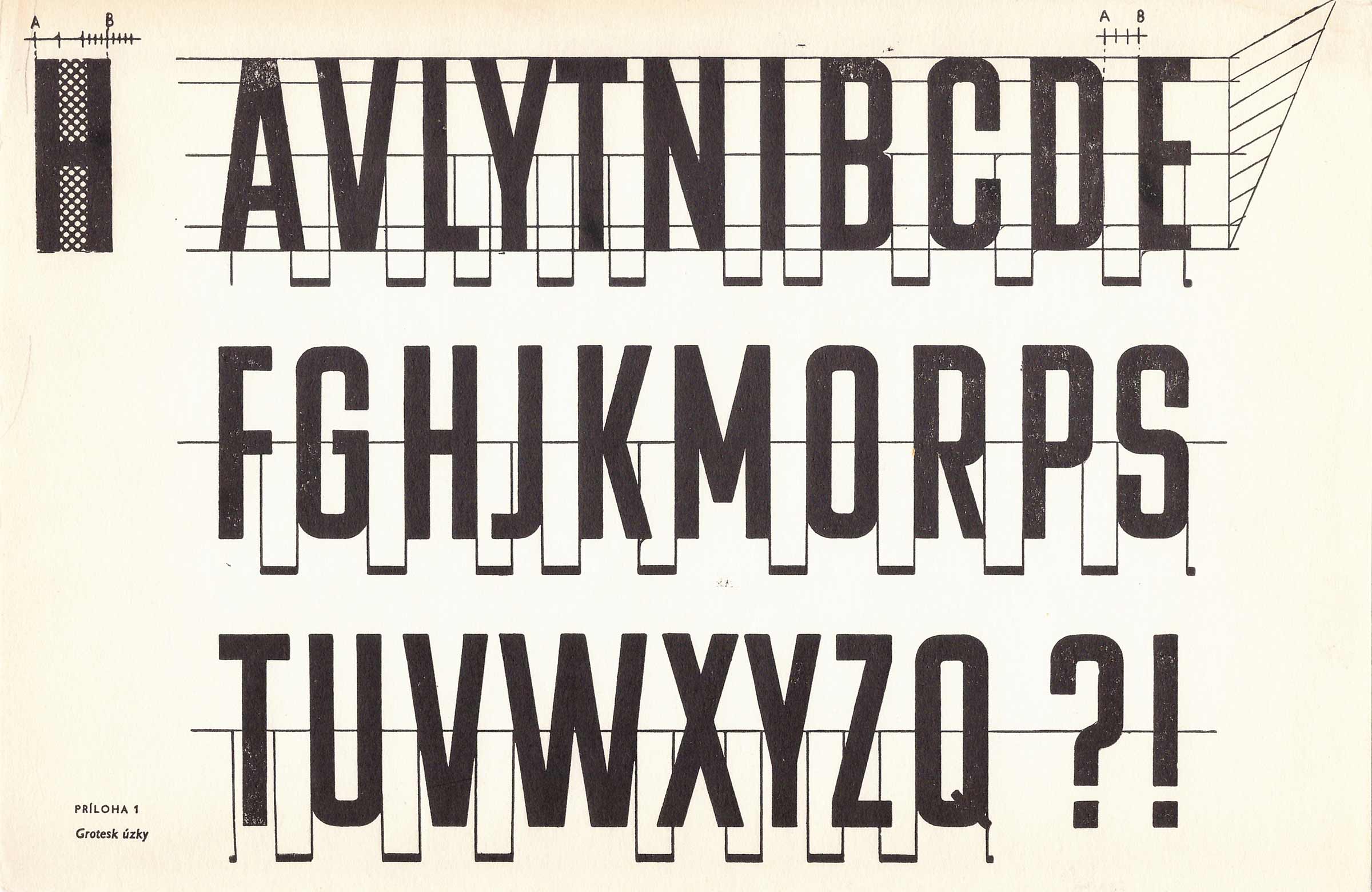
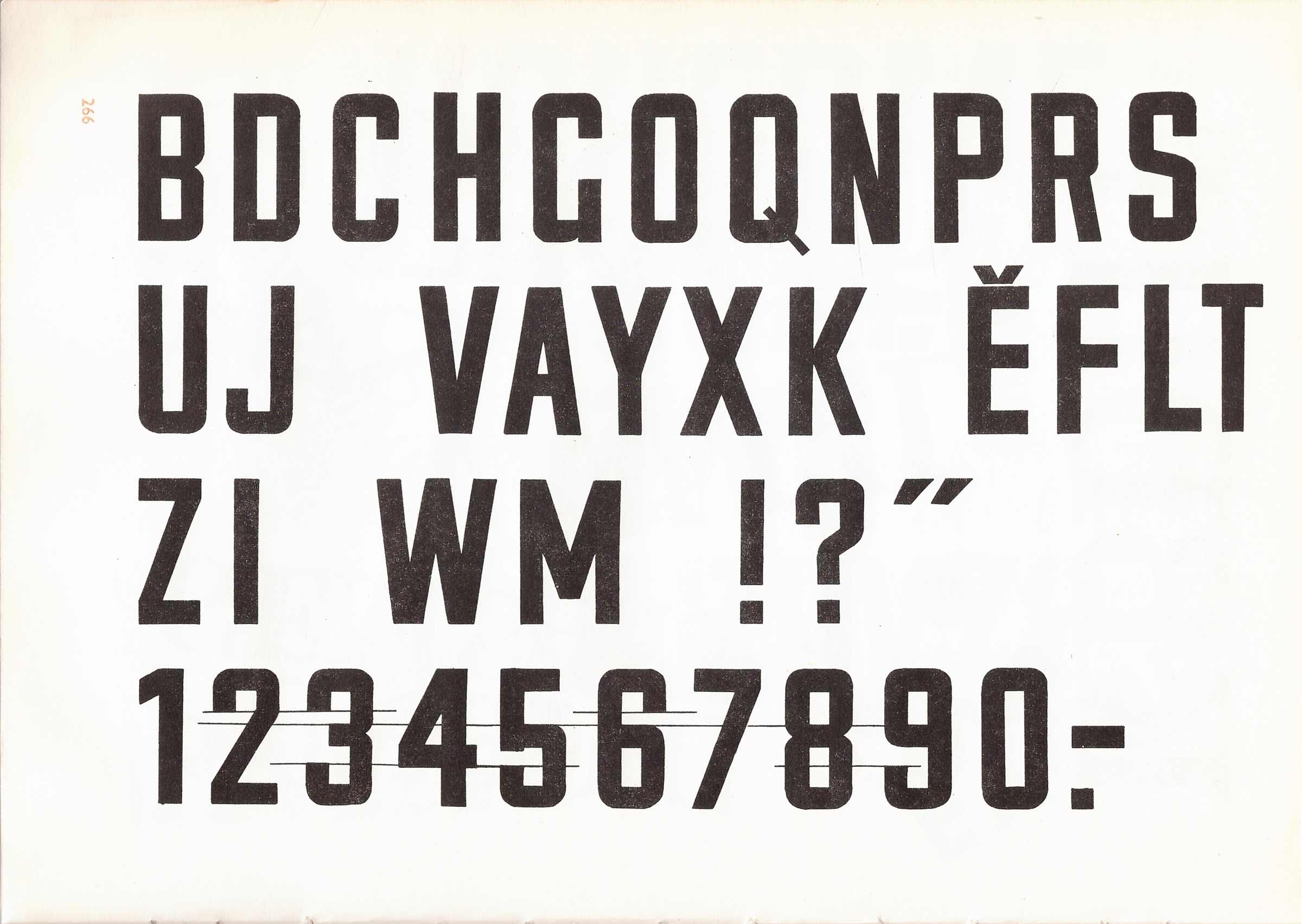
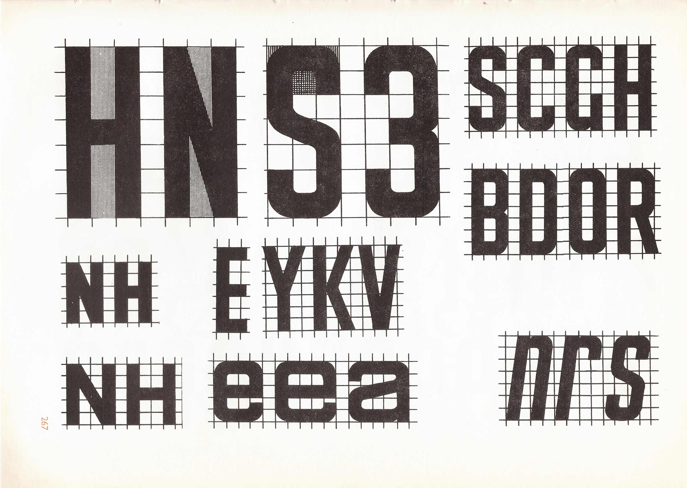
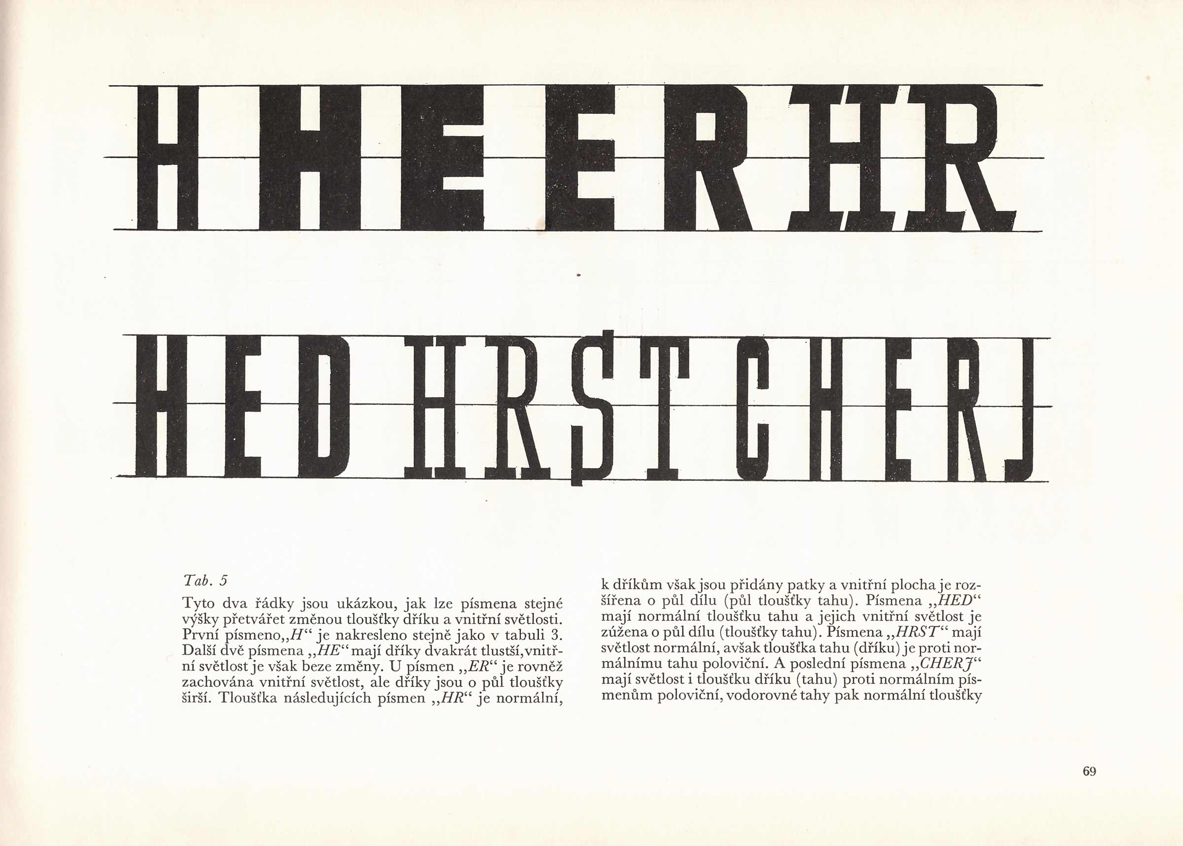
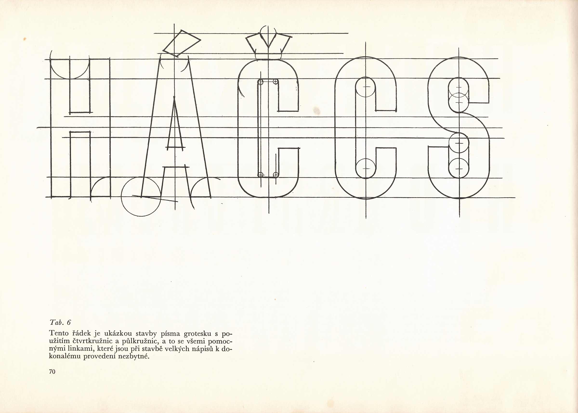
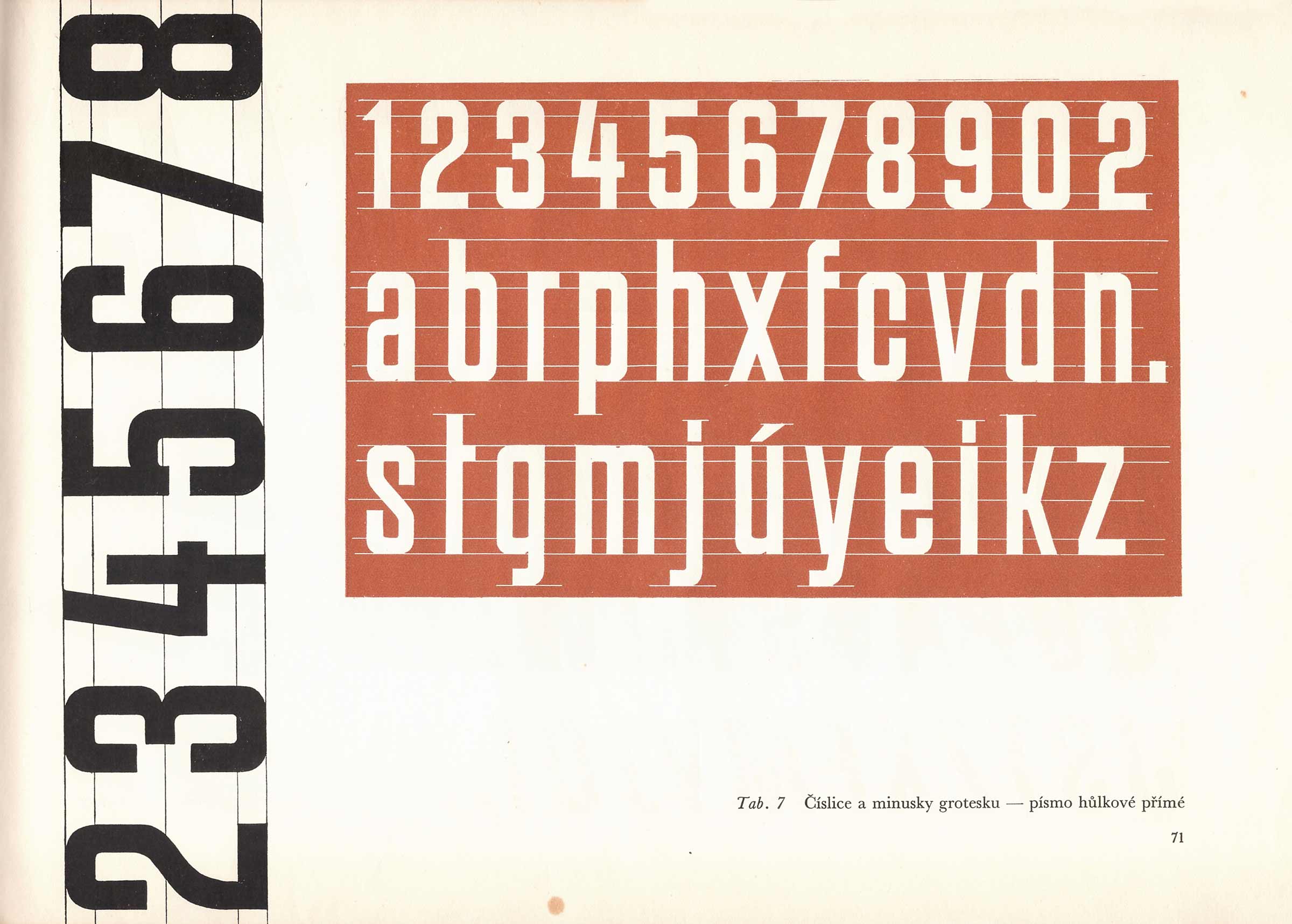
I consider the third publication I was able to get my hands on to be the most important. Apart from being the oldest one, there is a surprisingly detailed description of how to construct the font I was looking for. The publication Písmo a jeho konstrukce (Type and its construction) with a subtitle Příručka pro stavební obory (The Handbook for Construction Engineering Studies) by the Czech author Richard Pípal was first published in 1954. The typeface, in this book called Grotesk – a narrow upright all-caps font is here described in form of detailed instructions about proportions or widths of strokes, with a tutorial on how to construct individual glyphs.
Richard Pípal writes in the book’s preface:
I wrote this book because all publications that had been published in Czechoslovakia in the field of typography were focused either on typographical or on script typefaces. The typefaces in this book are designed to meet the needs of all the professionals dealing with type, whether the type is a functional means or a necessary element to complement their work. It comprises sign painting on various materials, works in stone, plaster, stucco, or metal. Since materials and instruments change the appearance and the shapes of letters, the fonts described in this book differ from the typical typographic typefaces.
The fonts described in this book are suitable for various sign painting projects, especially for use on buildings. There isn’t a street or a building in the interior of the city, where typography, as an important functional component, would not have a significant effect on their appearance. Therefore, every lettering work has to supplement the architecture both formally and chromatically and should be an organically involved component.
This comment on streets and buildings has also convinced me that the typeface described in this book could serve as a master for the fonts used on Slovakia’s street name-plates.
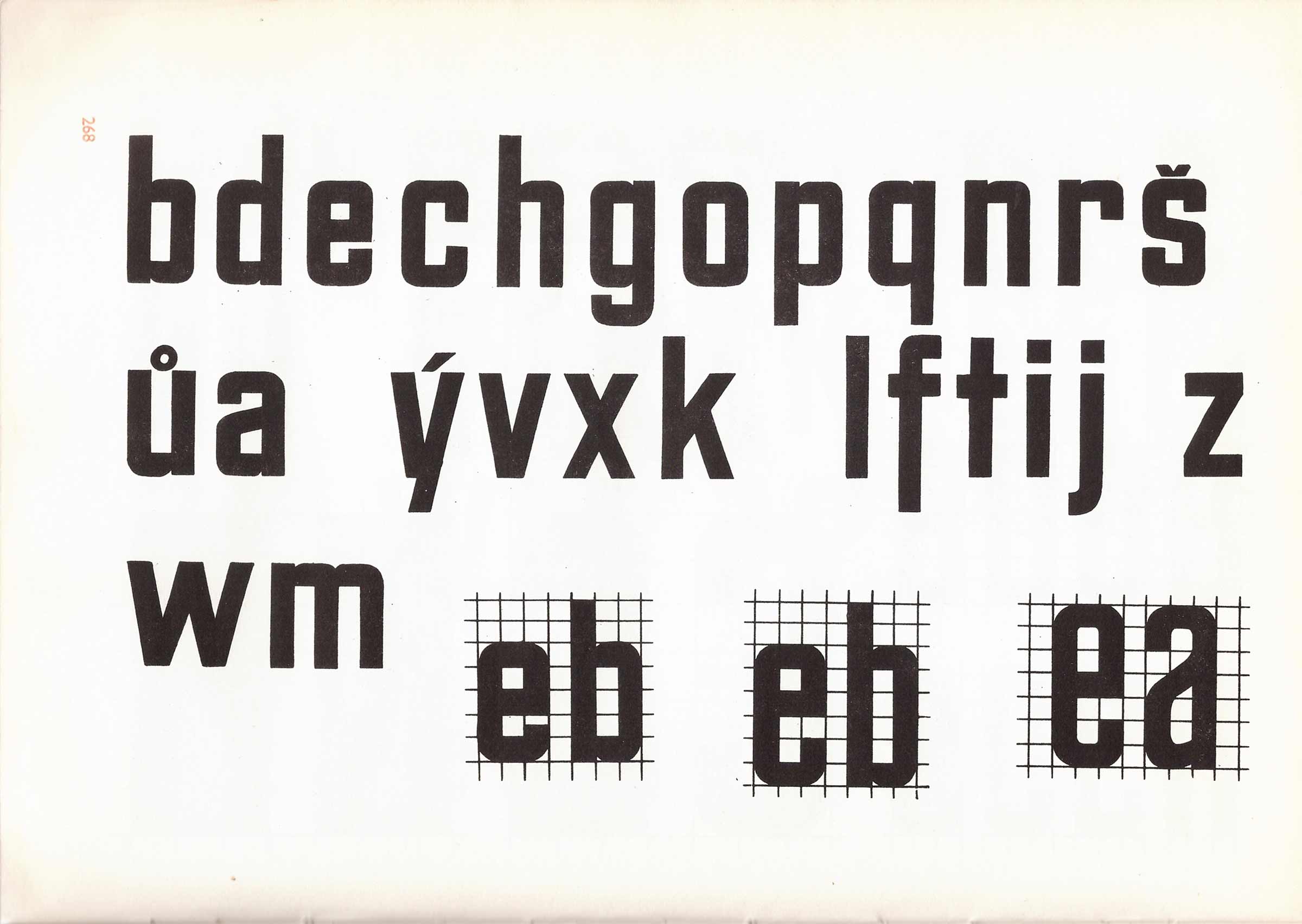
Richard Pípal created a simple, easy-to-remember, yet detailed construction model of a typeface that practically defined the visual appearance of Czechoslovak streets for at least 40 years (50s to 90s). Each glyph is composed of straight lines and circles exclusively, the font is highly modular and it is easy to modify it as needed at the same time – it is sufficient to define the basic proportions at the beginning and everything else is easily deductible. The same applies for glyphs not present in the original specimens. They can be designed without much trouble so that they fit in among the other characters just by adhering to the proportions and using the already existing modules. It is this simplicity and practicality that made this font so widespread.
Although the fonts mostly disappeared from the public space along with socialist slogans and mandatory decorations of windows and displays, thanks to the durability of some applications – especially the enamel plates, the typeface can be found literally on every street to this day. It just might need a little effort and time to spot it in all the visual chaos.