Woodkit
| Category: | Fonts |
| Published: | Oct 13 2014 |
| By: | Ondrej Jób |
Woodkit is a type system inspired by wood type and letterpress consisting of three families – each with six distinct styles covering various alphabet designs, components and miscellaneous ornaments.
Woodkit is a type system inspired by wood type and letterpress consisting of three families – Solid, Print and Reprint, each with six distinct styles covering various alphabet designs, components and miscellaneous ornaments. Woodkit supports Latin, Cyrillic and Greek scripts.
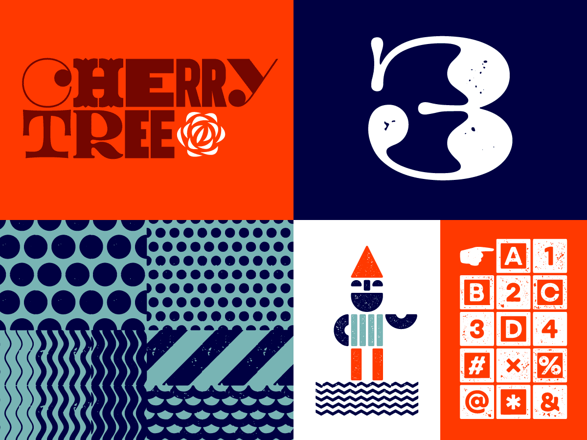
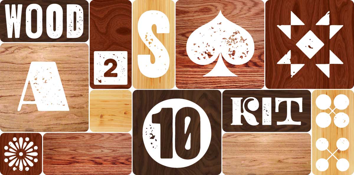
From both aesthetic and functional reasons, the most important feature of Woodkit is that every single glyph fills a square, not just horizontally, but also vertically. This is a reference and an homage to the physicality of the real life wooden blocks. It didn’t only induce some new and unexpected constructional solutions, it also gave the final font broad versatility, mutual interchangeability, many visual treats unavailable in proportional typefaces and most importantly – playfulness. Some of the fonts and shapes are outright inspired by wooden blocks and alphabets for kids. Therefore with Woodkit, typing also means building.
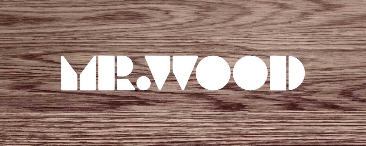
By now, it’s probably no big surprise that Woodkit originated as a custom logo for one of my friends. In March 2014, Zolo Kis of Mr. Wood asked me to design a logo for his new online store with wooden interior accessories. I came up with a logo constructed from simple blocks. I don’t know about kids these days, but the blocks were one of my most favorite things to play with. And apparently, I still have it in me today, even though it’s only on a computer screen. Just for fun, I quickly “built” a whole alphabet, then a second and a third set, then numbers and I only stopped after Greek and Cyrillic were done.
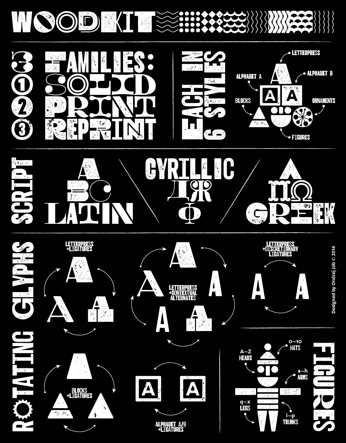
I love quick and simple projects like this one, but I tend to complicate them for myself. And this was no exception – once I got the idea to actually release this, more styles started to pop up in my head, resulting in a rather extensive kit of letters, shapes, ornaments and patterns. There are six styles in each of the three Woodkit families: Letterpress, Alphabet A and B, Blocks, Figures and Ornaments.
Letterpress
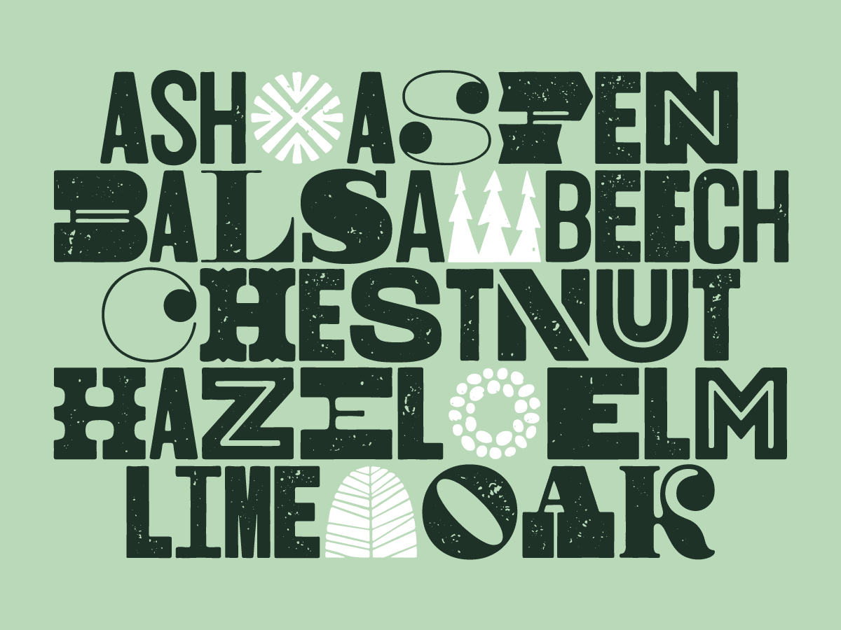
Even though Letterpress style was the last to be added, it has the prominent first spot in the family as it is probably the most “typographic” of the bunch. It draws inspiration from the 19th century wood type posters that literally competed in typographic overabundance of styles, colors and sizes.
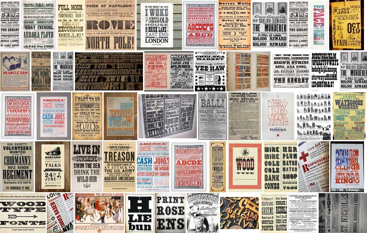
I tried to capture just that in Woodkit Letterpress fonts. Every glyph seems to come from a different printer’s case with only a handful sharing a similar style. With everything mixed together and combined with the print artifacts and small defects, the text set in the Letterpress style appears warm and friendly.
When typing with basic ligatures turned on, the font automatically rotates between three different versions for each letter or number. When two same glyphs are typed together, the font replaces them with their narrow variants so they fill just a single square together, adding a little bit of spice into the mix. With contextual alternates turned on, five different versions are being rotated, three full square and two half square wide. And finally, when discretionary ligatures are turned on, the font rotates only between the two half square versions. All this combined together allows for a rich setting where no two words look alike.
Alphabet
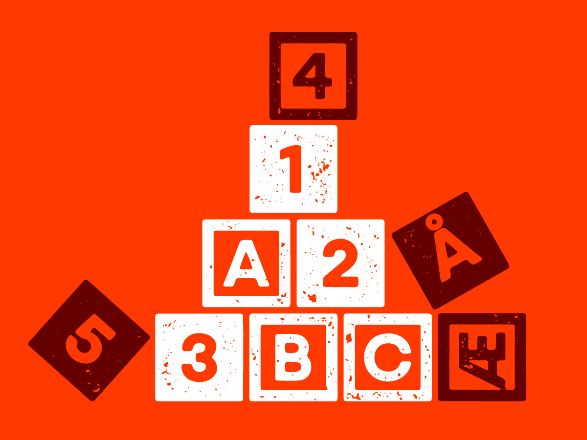
The Alphabet A and B styles are as simple as they sound – they are inspired by the basic ABC blocks used by kids who are learning to read. Available in positive (A) or negative (B) versions, they are great for marking sections, typographic mosaics or as drop caps. Simple!
Blocks
As mentioned above, the Blocks style represents the very essence of Woodkit. Every glyph is a unique stack of various blocks, there are no closed counters, no sharp corners and no complicated shapes that would be difficult to make in real wood.
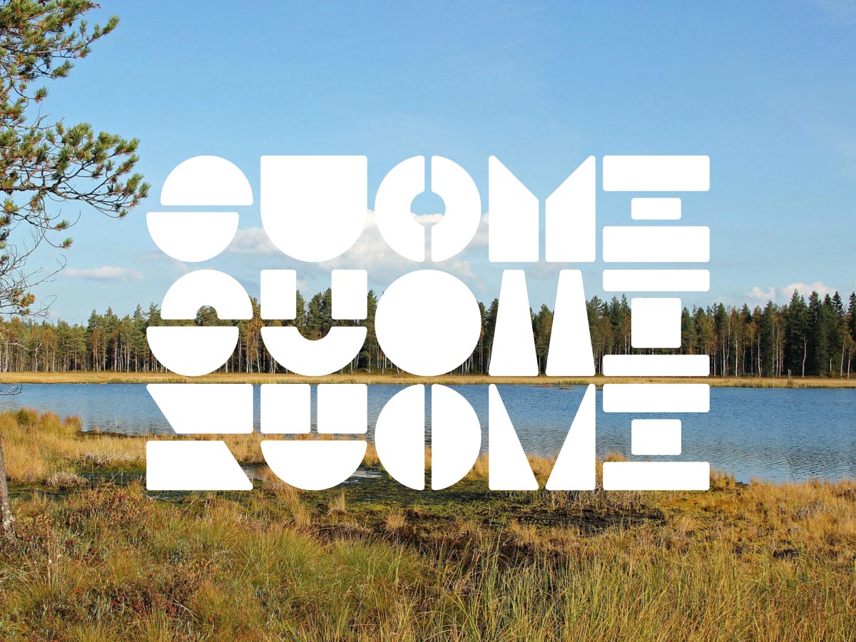
With the basic ligatures feature on, the font rotates between three different versions for each letter and number.
Figures
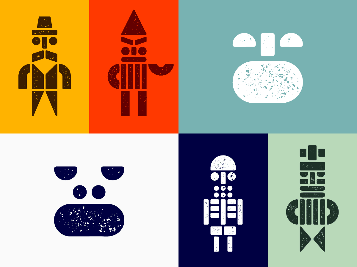
I couldn’t resist including this style in the family. It is the best demonstration of the playful character of Woodkit. I started to build first figures while drawing the Blocks style as it was a very natural thing to do. I stacked the blocks on top of each other to create letters, so why not try something else too? The result is almost 400 thousand possible figures – there are 78 heads, 8 arms, 8 legs and 8 trunks to choose from and 10 different hats to top it off.
Ornaments
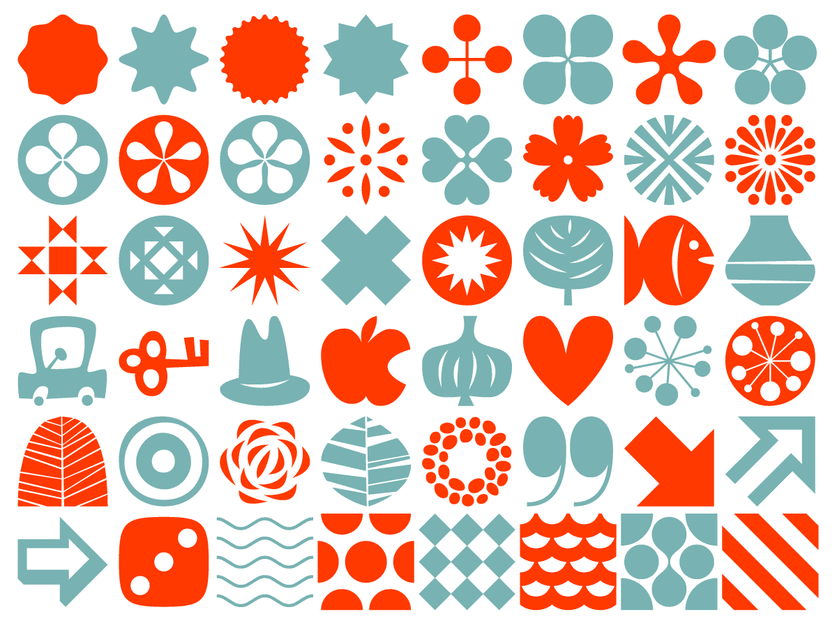
And last but not least, there are Ornaments, a selection of 500 symbols, shapes, mid-century-inspired dingbats and seamless patterns to complement the other Woodkit styles.
Some tips
- Use 100% leading (i.e. 20pt text size/20pt leading) to make the gap between lines and the space between glyphs equal.
- Use the Glyph palette in your graphic application to pick from all available versions of each glyph (click and hold on a letter with a tiny arrow in the corner)
- The style of each glyph always depends on the previous glyph. That means that changing the first letter in a word will affect all other letters following it. Quick and easy.
- Every glyph is 1000 units wide and the tracking setting in your graphic application uses the very same units. That means that setting the tracking, e.g. to +500, will create gaps between the glyphs that are exactly half-glyph wide.
To wrap it up, here is a visual overview of the whole Woodkit system. All fonts are distributed in OpenType TT format (.ttf) and available for purchase exclusively from Typotheque.
