Odesta
| Kategória: | Písma |
| Zverejnené: | 19. november 2013 |
| Autor: | Ondrej Jób |
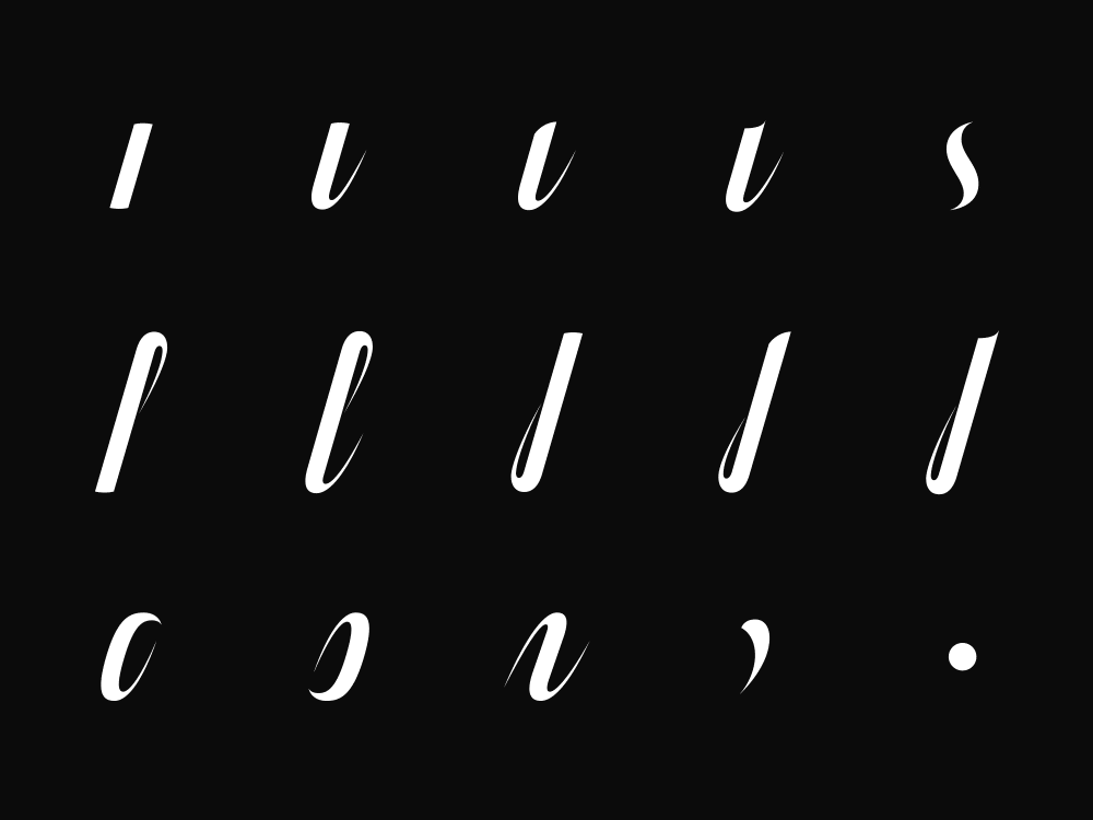
Odesta je dekoratívne nadpisové písmo s nespojitými ťahmi a výraznými guľatými terminálmi. Pozostáva zo 7 rezov s malými kapitálkami, ozdobnými variantmi, množstvom ligatúr a začiatočnými a koncovými formami pre každé malé písmeno.
Odesta is a decorative script typeface with detached strokes and pronounced ball terminals. It comes in 7 weights with small capitals, swash capitals, plenty of ligatures, and initial & final forms for each of the lowercase letters.
As many other Setup typefaces, Odesta started as a custom lettering. About a year ago a friend of mine asked me to design a logo for his wedding photography company called Wedding Story. I was fairly busy at that time with some other work so without much thinking I knew I'd be drawing a nice big script with some swashes for the word "Wedding" and then combine it with the second word set in calmer old-style capitals. And yes, I added some hearts too, because who wouldn't like to get their wedding day photographed by someone who has hearts in their logo, right? At least that's what I thought.

The first version of the logo had the strokes nicely connected, just like any normal script, but I wasn't sure if it had enough character for a logo. So while looking for something that would make it stand out from the sea of the lazy script font logos, I came up with the idea to detach the strokes, which I knew hasn't been done much in the script category so far. I was quite happy with how the logo turned out, how the two different styles worked together and I was especially excited about the stenciled effect — it was fresh and I knew I'd be making a full font from it sooner or later. It was the case with many of my projects before and it sure was the case now. Anyway, I've always admired fancy script typefaces and of course, I knew I'd have to make one for myself too one day.
Unfortunately, after sending out the proposals, my friend replied that they decided to stick to their original logo. Although I was a little disappointed that we didn't go through with the project, I'd already had the future type family planned in my mind so there was some positive outcome after all. Soon after, I started working on the regular weight.
I was thinking about designing a script typeface many times before — about half of the letterings I've done so far are scripts and I absolutely love writing and calligraphy, although I'm not very good at it. I hadn't proceeded with any serious design of a script typeface before mostly because I'd just felt too much respect for this category. Not only for the design part of it, but very much for the technical one too. Some of the typefaces from my South American colleagues are simply beyond my comprehension.
For Odesta, the design and the technology fortunately weren't so much of a problem, because detaching the strokes from each other not only gave the letters a special look, but also made the whole typeface modular. And that was pretty much in line with my slight OCD about round numbers, exact alignment, and overall visual order. I was able to design all of the lowercase letters in the very first session and I actually didn't need to change most of them ever since.
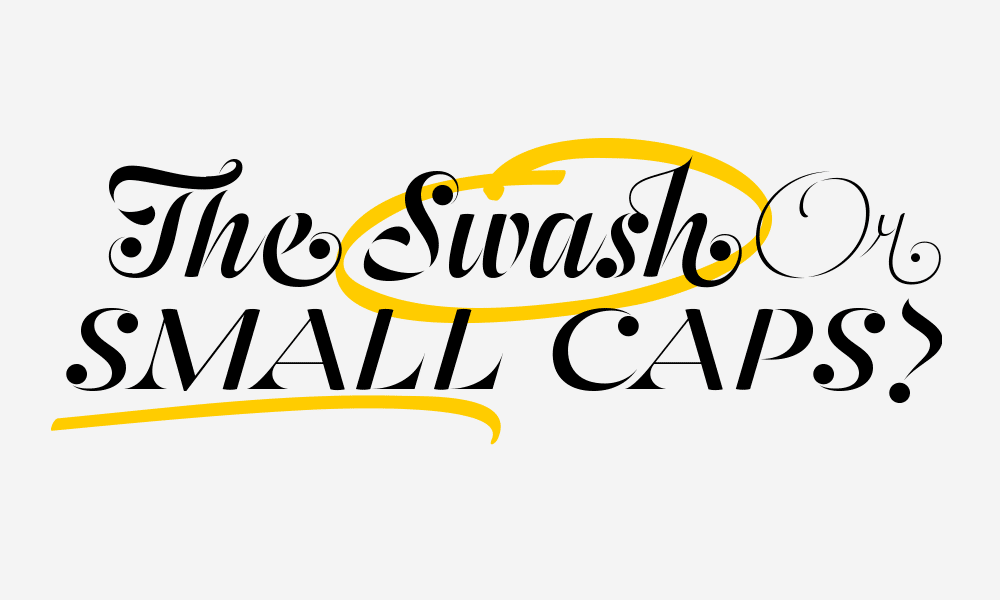
This, however, wasn't the case for the uppercase. First, I started with a set of non-swash capitals with the classic construction. They really worked well in all-caps setting and were quite satisfactory when used with lowercase. But I soon realized that not everything has to be experimental and decided to go for the expected solution — baroque swashes, ball-tipped style. These were where I probably did the most edits, basically changing them until the very last day. The decision to replace the original caps was indeed good, but they just were too nice to let go, so I decided to redraw them and use them as small capitals/titling alternates. (Although you can still use them as normal capitals — just turn on Stylistic Set 6.)
From the very beginning I knew I'd be drawing a multiple-weights type family. I actually don't quite get why there are so many script typefaces with only a single weight (and unfortunately, not only script typefaces). Extending the family with extra weights is so much fun! Seriously, if you make fonts, do it, if you use fonts, demand it. Personally, I just love it as much as designing the first style. So after the Regular weight, I started with the Hair, which was rather easy. The thing with Odesta is that the strokes always end with a sharp tip. This is very easy to do with a hair stroke. On the other hand, it made drawing the boldest weight somewhat complicated. Actually it was so difficult that I didn't even draw the Black weight — I drew the Bold and only when I tried to extrapolate anything bolder, I saw that it is actually possible to go beyond my Bold without loosing the elegance of the lighter weights.

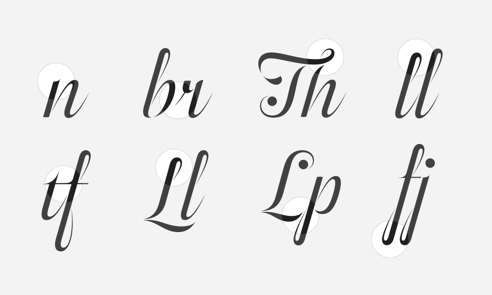
Of course, Odesta makes use of advanced OpenType typographic features and hopefully it has everything one might need in professional display typesetting. Besides the default old-style it also has a set of proportional figures, alternative designs for both the ampersand and the lowercase s, superscript and subscript figures, discretionary ligatures (despite the nature of the typeface, these actually connect!), but probably the most elaborate is the Standard Ligatures feature that quietly works without the need to turn it on. Here's a little breakdown of what it does:
I hope you will like to work with Odesta as much as I loved drawing it. Odesta is available for purchase exclusively from Village.